The world of search engine optimization often seems like the Wild West: with Google not providing any clear instructions on how to rank higher in the search results, both web developers and clients becomes confused as to how they should proceed with their website promotion. However, the answer lies in the name of the topic we’re about to discuss: search engine optimization. This means that we simply need to optimize the way our content is served to the search engine bots — and thankfully, there are clear guidelines on how to do that.
The benefits of SEO are self-evident: your web page ranks higher, gets more traffic, and makes more money. Curiously enough, SEO also encourages us to create valuable content: searching for a phrase like “hire freelance web developer” or “introduction to JavaScript” will most probably return an extensive guide spanning multiple thousands of words as #1 result. Although there are many SEO myths and legends, we believe that valuable content will ultimately rank higher — this belief is echoed by Google in their Quality Guidelines.
Proficiency in SEO is absolutely vital for today’s web developers: using the right tools and HTML tags, you can ensure that your content actually reaches its audience. In this article, we’ll explore 5 essential SEO tips you can utilize to improve your SEO game!
1. Structure your content via header tags
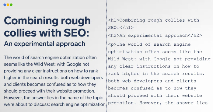
With today’s abundance of content, it’s extremely important to structure your texts for better readability and clarity — you can do it via header tags, ranging from h1 to h6. Still, headers tags aren’t designed for legibility only: they help search bots understand the contents of your page better. Here’s how they should be used:
- h1: This is a web page/article title: Combining Rough Collies with SEO.
- h2: This is the article’s subtitle/one of its main points: An experimental approach.
- h3: This is the article’s structure point: Historical background.
- h4, h5, and h6: Various sub-points.
2. Don’t fear JavaScript — but use it cautiously
JavaScript is a notorious aspect of search optimization as it’s not clear how well (or how badly?) JS-heavy websites perform in Google’s rankings. Single Page Applications, or SPAs, seem to experience the most trouble: their dynamic content is served, as the name suggests, on a single page — this prevents Google from hashing the URLs and hinders SEO for this particular type of web apps.
Here’s what we think: with today’s web development landscape looking like a SPA resort (ba dum tss! ( ͡° ͜ʖ├┬┴┬┴), Google is working hard to enable its bots to crawl single page applications effectively. At the moment, however, the results aren’t that impressive: SPA developers remark that their web applications suffer from poor SEO performance.
Until Google perfects crawling SPAs, you can utilize some tricks that improve how SPAs perform SEO-wise. One such trick was described in our Top 10 Vue.js Interview Questions article: Vue applications are somewhat lacking in SEO-friendliness — this is an important factor to consider beforehand; this can be remedied by choosing server-side rendering over client-side one, but this option may not be ideal for some projects. This is where we can use Nuxt.js, a Vue.js framework created to address these issues. Nuxt solves the SEO problem by generating the app on the server and managing routes (enhancing the SEO tags you add), redirecting bots to the static pre-rendered content.
For Angular, you can use Angular Universal — this library will render HTML on the server and serve it to the search bots — still, your hosting service is required to have Node.js enabled.
(For a more in-depth discussion of the “Is JavaScript the devil?” problem, you can check this episode on JavaScript in the “SEO Mythbusting” series presented by Google Webmasters and their “Deliver search-friendly JavaScript-powered websites” talk from Google I/O 2018)
3. Ensure accessibility
The web accessibility goal is to address the needs that include visual, motor/mobility, auditory, cognitive/intellectual needs and/or seizures, with the main design point being to provide unrestricted information access to all people. For users relying on devices like screen readers, accessibility is absolutely vital for understanding the content.
Search bots perceive content in a similar fashion — not via images, audio, or video (not yet, at least), but through text and the descriptions that the developer provided. Therefore, accessibility influences the SEO ranking of a website: although it’s not a direct factor, it’s safe to assume that web pages with poor accessibility will be seen as “providing not-so-valuable content”.
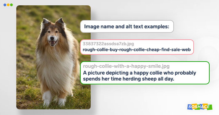
Accessibility is a wide topic in and of itself, but a really good start is to naming your images in a clear way and providing relevant alt descriptions: on the one hand, it helps screen reader users to “see” the image; on the other hand, it helps the search bots to index your content. Another good option is structuring your content via header tags (as described in Tip #1).
4. Ensure mobile-friendliness

With more and more traffic coming from mobile devices, Google has been highlighting the importance of parity between mobile and desktop site versions. Even though you may be preferring not to focus on mobile users, it’s important to remember that Google will soon (starting July 1, 2019) start using mobile-first indexing: this means that the desktop version of your website isn’t the litmus test anymore. So how can you configure the mobile version of your web page?
- Suboptimal methods. A) Assigning desktop and mobile versions different URLs (e.g. collie.com and m.collie.com) — this method is the least optimal as it forces the developer to deal with a plethora of SEO-related issues that “mobile URLs” (m.collie.com from our previous example) have. In short, Google doesn’t really value content with different URLs. B) Dynamic serving — presenting users with pre-rendered site versions based on their device type (prone to becoming obsolete with the release of new smartphone models)
- Optimal method. Responsive design lacks the headache-inducing problems described above — and Google recommends this method over the other.
As accessibility and mobile-friendliness are heavily intertwined, providing relevant alt-text alongside structured data makes a real impact on the search ranking of your website. Naturally, all content and meta-content (title, description, tags, hreflang, and so on) should be equivalent in both versions.
However, optimizing for mobile devices is a constant process — and you can use Google Search Console to keep track of it.
5. Use Google Lighthouse to perform audits
Even though Google prefers to avoid explicit instructions like “Use the word ‘Hereinbelow” at least three times in your article to rank higher!”, the company still provides a great blueprint for improving your search optimization: this tool is called Google Lighthouse and it can be accessed via Chrome Developer Tools (either from the menu or by pressing Ctrl+Shift+I).
Lighthouse can perform SEO audits against any page you’d like: just open a web page, then open Chrome Developer Tools → “Audits” tab → check “SEO” and run the audit. The process usually takes from 1 to 1.5 minutes (in the meantime, Lighthouse will show you insightful statistics like “BBC has seen a 10% decrease in users for every extra second it took their website to load”); then, the audited web page will be given a performance score. Here’s the SEO audit results for our main page, soshace.com:
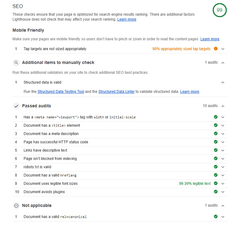
Pretty neat! As you can see, Lighthouse uses various criteria (some of which we’ve discussed above) to assess the web page’s SEO score — additionally, you can read about each criterion further by clicking on it → “Learn more”.
Conclusion
Search engine optimization and web development should go hand in hand when it comes to creating a great website with valuable content. You should utilize these tips when creating your next killer projects! 🙂

