Accessibility in web development is a broad field, it covers web performance; how people with a slow internet connection access your website, internationalization(I18n); how you make your website accessible to people speaking different languages and finally web accessibility also covers how people with disabilities can interact, navigate and use our websites.
What we will be covering in this article is how to help people with disabilities use our websites.
What is Accessibility(A11y)?
Web accessibility means that people with disabilities can use the web. Accessibility is about making all the functions of your websites available to anyone regardless of how they access your website either through a screen reader or braille display, using a mouse only or keyboard only, etc.
What is a disability?
According to WHO (World Health Organization), “Disability is an umbrella term, covering impairments, activity limitations, and participation restrictions. An impairment is a problem in body function or structure; an activity limitation is a difficulty encountered by an individual in executing a task or action; while a participation restriction is a problem experienced by an individual in involvement in life situations.”
The definition of disability by WHO covers disabilities in general, but what we are concerned with here is disabilities
that affect the use of the web.
There are four major groups these kinds of disabilities fall into:
- Visual
- Auditory
- Motor
- Cognitive
Why Accessibility?
Accessibility is important to the web because it ensures that our websites are accessible and usable by everyone, accessibility is not about creating a different web for disabled people, it about ensuring that when we are designing our websites we should consider our diverse userbase and make sure we design for everyone; accessibility ensure inclusion. Accessibility also benefits people without disability because more accessible has better usability.
Some other benefits of web accessibility are:
- Improved Traffic: It helps improve web page traffic because no-one is excluded from using your website.
- Improved SEO: Search engines can understand your content properly because you used the right semantics which
leads to because indexing.
We are acquitted with what accessibility is and some of the benefits of building accessible websites, we will be talking about things you can do to make your website accessible and tools you can use to test accessibility.
Making Accessible Layouts
The layout of a webpage has more to do than placing the elements in the right position and presenting information clearly to users visually, it is also important for your layout to be structured for your non-visual users so when they are interacting with your website the information given back to them by whatever assistive technology they are using has context and a function instead of being a pile of useless information.
Usually, the average website is made up of the layout, forms, tables, images, text etc. These are some of the elements users get to interact with and it is important for these elements to be accessible by all our users.
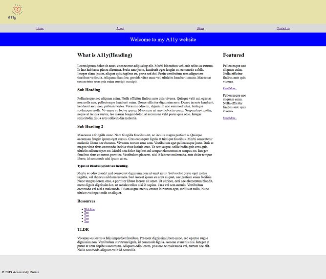
Above is a simple layout I designed(your favourite designers will be jealous). Visually the logo, navigation, banner, main content, sidebar and footer seem well placed but for assistive technology like a screen reader this layout has no structure and it is information without context and a function.
If you looked through the source code or used a screen reader like JAWs, NVDA, Chromevox etc. you will notice some problems with this layout, a `div` is used to outline every section, we should have used the right semantic tag for each section, the logo has no alternative text, the headings are created using a `p` tag , the navigation bar is not obvious, the headings are not differentiated from the paragraph etc.
These are some of the accessibility issues you might have on a web page. So how can we fix these issues and some other ones that were not evident in that simple layout?
Lang Attribute
The lang attribute is a global attribute used to set the language of the text content on your web page. it is usually set on the `html` element so it is inherited by every other element on the page but it can be used on any other html element. The language attribute is useful to screen readers because it helps them detect the language so it can use the right pronunciation and accent for the page contents.
<html lang="en">
	<!--  -->
	<!--  -->
	<!--  -->
</html>
Also if you have some content on your page that is in a different language from that in the `html`, then use the
`lang` attribute on that element.
<p lang="en">
	What is accessibility in french
	<span lang="fr">Qu'est-ce que l'accessibilité en français?</span>
</p>
Title tag
The `title` tag is usually put in the <head> of an HTML to indicate the title of a web page. The <title> is important to assistive technologies like screen readers because the title is the first thing announced and it helps users know the content and function of that web page. So it is important that the title describes the page content and purpose. The best practice for choosing a title is to place the page description/function text first and then the site’s name/information.
<title>
	Guidelines to accessibility - Soshace blog
</title>
Skip Links
Skip links helps keyboard users navigate to areas of interest like navigation or the main content on a web page instead of listening to screen readers announce unnecessary content before getting to areas of interest. Skip links should be second focusable elements after the document, placed close to the opening body tag and made visible when it is focused on.
<body>
	<a href="#nav" id="skip" role="navigation">Skip to navigation</a>
	<a href="#main-content" id="skip" role="navigation">Skip to Content</a>
	<!--
        --------
        --------
        --------
        -------- -->
</body>
#skip {
position: absolute;
left: 0;
top: -40px;
background: red;
color: white;
z-index: 9999;
padding: 10px;
}
#skip:focus {
top: 0;
}This is a useful pattern implemented on news websites like The Telegraph, The Sun, and The New York Times, etc. that have a lot of links or tabbable elements before the navigation or main content. This feature might not be useful in my simple layout above but it is a useful feature that aids accessibility.
Layout sectioning/outlining
Assistive technology like screen readers usually provides alternative means of navigating a page like helping users jump to different contents like Headings, Links, Forms, Paragraphs, Navigation, etc. This is only possible when we structure our layout using semantic HTML elements(`nav`, `main`, `footer`, `header`, `aside`, `section` etc.). Using the right semantic elements have other benefits beyond accessibility.
- It helps assistive technologies like screen readers communicate the contents of the page properly to a user.
- It improves search engine optimization because SEO bots can parse, understand and index your content properly.
When you use `p` tags for all the text on a web page including the headings and `div` to structure/section your page you don’t get all those benefits and it becomes difficult for screen reader users to understand what is on your webpage.
If you look through the HTML of the layout I designed you will see that the headings are just styled `p` tags therefore when it is being read to the user there is no distinction between the headings and paragraphs. Also `div` was used to section the layout so screen readers won’t be able to tell if the item being read out is a navigation menu, main content, sidebar or footer. We can fix these using the right semantic HTML tags where possible.
The following are HTML elements used to outline a page and their usage:
- header tag: According to MDN, the `header` element represents introductory content, typically a group of introductory or navigational aids.
- nav tag: is used to identify a section on a page that contains navigation links. it is possible to have multiple nav elements on a page.
- aside tag: According to MDN, aside element represents a portion of a document whose content is only indirectly related to the document’s main content. Asides are frequently presented as sidebars or call-out boxes.
- section tag: is used to group related content on a page, a section is a generic element like a `div` but it is advised the contents of a section should be related in some way.
- main tag: is used to identify the important content in the body of a web page. Content in the main should be unique to every page and a document should not have more than one main.
- article tag: is a group of content that can be reused or independently distributed and can be used multiple times on a document/web page. The content of an article can be moved to another page and it should make sense e.g A blog post or newspaper article etc.
- footer tag: According to MDN, the `footer` element represents a footer for its nearest sectioning content or sectioning root element. A footer typically contains information about the author of the section, copyright data or links to related documents.
- Heading: Headings which come in six(6) levels h1- h6 are used are section headings. As seen in the layout I designed <p> tags were used to represent the section headings, this is semantically incorrect because headings are used to create hierarchy in a document not just make text bigger and bolder, also they help distinguish headings from paragraphs.
When using headings on a page it is important not to skip heading levels, your heading should start with a <h1> and subsequent headings should be <h2>,<h3>,<h4> and so on because screen reader users tend to navigate from heading to heading to get an overview of the contents on a web page so skipping a level might cause confusion for the user.
Finally according to MDN “You should consider avoiding using <h1> more than once on a page”.>
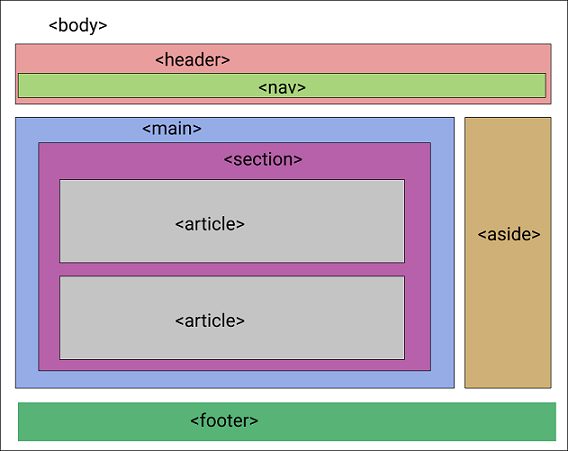
This is not are exhaustive lists of how we can make our layout accessible but these are good starting points in making them accessible. Below is the same layout but we have made some of the changes like adding a skip link and using semantics tags, now the layout is more accessible than before and the design is still the same.
Now let’s see how we can make forms, tables, and images accessible.
Forms
Forms are an important and popular part of web applications, it is one of the ways users interact with a website. It typically has a label, input controls, and a button.
Labels
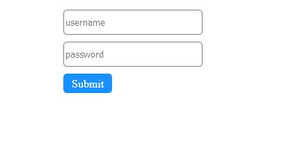
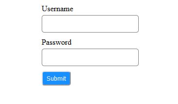
There is a common pattern in websites where input fields don’t have a label and the placeholders are meant to act as a label.
Visually the placeholder might be enough to describe what should be entered into the input field but it is not for non-visual users because not all screen readers read placeholder text aloud and when text is entered into the input field the placeholder disappears.
In order to make input fields accessible to users make sure it has a <label> tag for that input field. The `for` attribute of the label should match the `id` attribute of the input, this helps associate that label to its input field.
<form action="">
	<label for="username">Username</label>
	<input type="text" id="username" />
	<label for="password">Password</label>
	<input type="text" id="password" />
	<button>Submit</button>
</form>

In some cases, you might not want an input label because it seems visually redundant like a search field.
<form action="">
	<div class="search">
		<label for="search" class="visually-hidden">Search</label>
		<input type="text" id="search" placeholder="search" />
		<button>Search</button>
	</div>
</form>
You can hide the label from visual users but it should be available to non-visual or screen readers because they need as much information as they can get to fill that field correctly.
if you need to hide the label do not use `display: none` or `visibility: hidden` because these also hide it from screen readers, use the CSS snippet below and add the `visually-hidden` class to the label.
.visually-hidden {
	clip: rect(1px, 1px, 1px, 1px);
	clip-path: inset(50%);
	height: 1px;
	width: 1px;
	margin: -1px;
	overflow: hidden;
	padding: 0;
	position: absolute;
}
This snippet was gotten from WebAIM website.
Buttons
Another common pattern you must have seen in forms is using styled `div` tags as buttons. This is wrong because a `div` is not a tabbable element so keyboard users will not be able to focus on the ‘button’ and perform any action on it. Secondly, buttons come with some in-built properties and functionality that a `div` does not have. You might be tempted to do this:
<div onkeypress="press()" tabindex="0" role="button" onclick="click()">
	bad button
</div>
Don’t do this, This is not accessible. Instead of going through the stress of making a `div` a button just use a `button` tag.
Form Errors
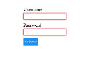
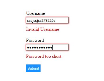
It is important to be able to communicate form errors clearly to all users of our webpage. There is a common pattern for communication field errors that are not accessible.
Visually users might know there is an error in this form but this doesn’t provide any feedback for assistive technologies(screen readers). One way to make your form errors accessible is by putting the error message inline or under their respective input field. This helps users know what field have an error in them.
These error messages must be associated with their respective input fields using the `aria-describedby` attribute.
<form action="">
	<label for="username">Username</label>
	<input
		type="text"
		id="username"
		name="username"
		class="error"
		aria-describedby="usrerror"
	/>
	<span id="usrerror" class="error-text" class="error-text"
		>Invalid Username</span
	>
	<label for="password">Password</label>
	<input
		type="password"
		id="password"
		name="username"
		class="error"
		aria-describedby="pwderror"
	/>
	<span id="pwderror" class="error-text">Password too short</span>
	<button>Submit</button>
</form>
it is important that the `id` of the error message element matches the value of the `aria-describedby` attribute on the input control, this helps associate the error message to its respective input field.
Required Fields
Forms usually contain fields that are required, there are several ways indicate required fields that are accessible to all users.
- Use Asterisk: You can mark a field as required using an asterisk in the label, Screen readers users know that when the label is announced followed by the asterisk(star) sign that input field is required. Use this in addition to the `aria-required` attribute so the screen reader announces that the field is required.
<form action="">
	<label for="username">Username <span class="required">*</span></label>
	<input type="text" id="username" aria-required="true" />

	<label for="address">Address <span class="required">*</span></label>
	<input type="text" id="address" aria-required="true" />
	<label for="phone">Phone <span class="required">*</span></label>
	<input type="text" id="phone" aria-required="true" />

	<button>Submit</button>
</form>
- Add required to label: You can also specify that a field is required by adding a “required” text to the label. There is no use of adding the `aria-required` attribute to the input field but it is redundant.
<form action="">
	<label for="username">Username (required)</label>
	<input type="text" id="username" aria-required="true" />

	<label for="address">Address (required)</label>
	<input type="text" id="address" aria-required="true" />
	<label for="phone">Phone (required)</label>
	<input type="text" id="phone" aria-required="true" />

	<button>Submit</button>
</form>
Tables
Tables might not be as common as forms in a webpage but they are frequently used to present information like a set of data, comparison between different data sets etc.
Most times visually the contents of a table will be easy to understand but that doesn’t mean it is understood by screen reader users. There are a couple of things we can do to make our tables accessible.
Use table headers (th) and Scope attribute
For visual users, it is easy to identify what row and columns are the table headers but screen readers need a way to identify what columns or row are headers. When creating a table use <th>(table header) tag for the headers, this helps the assistive technology differentiate a header cell from a data cell. The `<th>` has a scope attribute that can take any one of four values(`col`, `row`,`colspan`,`rowspan`). the scope attribute tells the assistive technology(screen reader) if the header is for a row, column, group of rows or group of columns.
The `th` and `scope` attribute are useful to screen reader users because for every data cell read out their respective headers are also read out too, this provides enough context and information to non-visual users to interpret the table correctly.
<table >

			<thead>
				<tr>
					 <th scope="col"> </th>
					 <th scope="col"> React </th>
					 <th scope="col"> Vue </th>
					 <th scope="col"> Svelte </th>

				</tr>
			</thead>
			<tbody>
				<tr>
					<th scope="row"> Bundle size</th>
					<td> 31.8kb  </th>
					<td> 20.9Kb </td>
					<td> 2.7kb</td>
				</tr>
				<tr>
					<th scope="row"> Release date </th>
					 <td> 2013 </th>
					 <td> 2014 </td>
					 <td>  2019</td>
				</tr>
				<tr>
					<th scope="row">Github stars</th>
					 <td> 137k </th>
					 <td> 149k </td>
					 <td> 24k </td>
				</tr>

			</tbody>
			</table>
Caption tag and Summary attribute
The table tag has a `summary` attribute that can contain a brief summary or description of the table contents. This is useful to screen reader users because it helps them determine if they need to listen to the rest of the table of just skip it.
<table summary="Details of React, Vue, Svelte and Angular 2">
	<!--  -->
	<!--  -->
	<!--  -->
	<!--  -->
</table>
The `caption` tag is another useful element that makes a table more accessible, it acts as a label/title for the table. It can help give non-visual users context on what the table is about. Usually, the contents of the caption are read out by the screen reader before it starts reading through the table.
<table summary="Details of React, Vue, Svelte and Angular 2">

			<caption>Frontend javascript frameworks</caption>

                        <!--  -->
	                <!--  -->
	                <!--  -->
	                <!--  -->
	</table>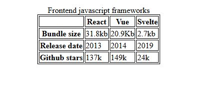
Images
Images are some of the most popular content on a website yet it is still one of the points with the most accessibility concerns on a webpage. An image can be made accessible by simply adding an alternative text for that image, but adding an alternate text is not enough, the alternative text should describe the content of the image and its function if it has one.
There are several ways of adding alternative text to an image, it can be added through the `alt` attribute, it can be provided in text close to the image and in some cases where the might be too long, a
`longdesc` attribute can be used that references a separate page containing a detailed description.
Some rules for writing alternative text includes :
- The alternate text must accurately describe the content of the image and its function in that context.
- The alt text should be short, not more than a few words. If you need to give a detailed description use the
`longdesc` attribute. - It should not provide the same information as text around the image.
- Avoid using phrases like ‘image of’, ‘picture of’, ‘illustration of’ in the alternative text.
We commonly have four types of images on a web page:
- Informative Images
- Decorative Images
- Complex Images
- Functional Images
These images are different so they required a different approach for writing their alternative text.
- Informative Image: These are images that are supposed to provide some information to the users or supplement text information around them. For informative images it is important it has an alternative text that describes the content of the image and its function if it has one. In some cases where the text around the image already describes it effectively, it becomes redundant to put that description in the alt attribute, in that case, leave the alt attribute empty.
Example:
Sample image The alternative text for this image can be:
<img src="catanddog.jpg" alt="Cat and Dog" />
The alt text is okay but not good enough, it is not descriptive enough to tell the users what actually is in this picture.
<img src="catanddog.jpg" alt="Cat playing with a slightly uninterested dog" />
This is a better alternative text for this image because it describes what it is effectively.
- Decorative Images: These are images that serve no function on a page and are just decorative. For decorative images leave the alt attribute empty so screen readers and other assistive technologies can ignore it.
<img src="background-pattern.png" alt="" />
- Complex Images: This is images like charts, graphs or diagrams that contain too much information and might not be succinctly described in the alt attribute. The description of such an image can be provided on a separate page and a link to that page can be put in the `longdesc` attribute in the `img` tag .
<img
	src="chart.png"
	alt="Line chart of the percentage of people with visual disability in US"
	longdesc="visual-dis.html"
/>
Alternatively, since longdes attribute is not supported by all screen readers you can put a link to the description adjacent to the image and then associate the lin to the image using the figure and figurecaption element.
<figure>
	<img
		src="chart.png"
		alt="Line chart of the percentage of people with visual disability in US"
	/>
	<figcaption>
		<a href="visual-dis.html"
			>People with visual disability in US text description of the line chart</a
		>
	</figcaption>
</figure>
- Functional images: These are images that have to perform certain functions on a webpage like a share post icon, navigation, download or print icons.

Social icons These are the share icons from my personal blog, this is an example of a functional image and you might think the correct alternative text for those icons is twitter, LinkedIn, and copy but that is wrong. The alternative text for functional images should describe the function of the images instead of what the image is.
So the correct alternative text should be<img src="twitter.png" alt="share on twitter" /> <img src="linkedin.png" alt="share on linkein" /> <img src="copy.png" alt="copy link to clipboard" />
Tools for testing accessibility
There are a couple of tools you can use to test accessibility on your website. There are websites where you can upload your html file or provide a link to your website and it will give you an audit report on your site’s accessibility. Also, the Firefox and chrome browser devtools have a tab for accessibility. These tools will programmatically test the accessibility of your web page but using your website the same way a disabled user will, using keyboard only and a screen reader like NVDA, JAWS, Voiceover(Mac) or Chromevox(Chrome) is the best way to test your site’s accessibility.
Some tools for testing web accessibility:
- Wave accessibility tool
- TAW
- 508 checker
- A-Tester
- Firefox Developer Tools
Conclusion
Accessibility is a must, it not only shows we have empathy for our users but when your site is not accessible you are losing out on a good number of users and excluding them from using your website, according to WHO about 2.2 billion people have some sort of vision impairment. Apart from the loss of userbase, in some countries, you might be in legal trouble if your website is not accessible.
As seen in the article making our websites accessible is not difficult, most of the time it just requires us using the right semantic elements and adding alternative text to our images.

