Skyrocket Your Business
With Soshace Digital Marketing Experts
We specialize in generating more customers, sales, and leads for your business through proven marketing strategies.
SERVICES
Your company is in great hands as our team of skilled marketers transitions your dream into reality.
OUR SERVICES
Let's Grow Your Business Today
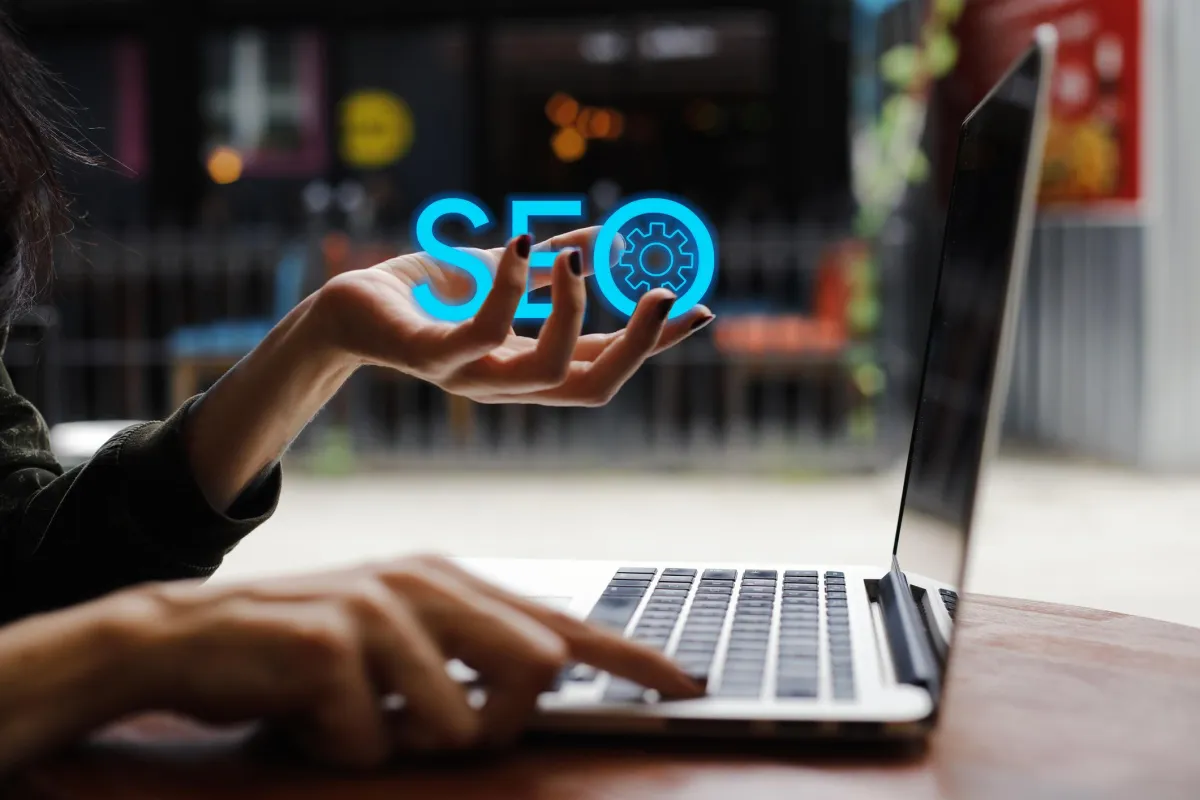
SEO
We have the ability to massively boost your website traffic. Utilizing sophisticated algorithms used by search engines like Google.

Web Design
Our development team consists of creative experts who are constantly working to further perfect their craft. With an arsenal of skill.

Social Media Marketing
Trying to boost your revenue too? Our services don’t stop at SEO services and increasing potential customer traffic.

Reputation Marketing
Your online reputation will make or break your company in the eyes of your customers. We have a unique approach in building your reviews on platforms like Google and Facebook as well as sharing all of the good news with your ideal customer.

Paid Advertising
Running paid advertising will allow you to predictably control your incoming customers and leads. Our team of experts leaves no stone unturned as we run paid traffic campaigns every single day!
We Make Digital Marketing Work For You
See how online marketing can transform leads into sales. Get more leads, get more sales with us.

Digital Marketing Services
We Offer
Whether you’re looking for more leads, better leads, or new leads (or just any leads at all), our team can help you reach your goal. We’ll put your website on the first page of the search engine results pages (SERPs). We’ll build your website. We’ll build your follower base on social media and convert them into loyal customers.
We’ll do all of these with our proven online marketing services and strategies.

High-End Analyzing
In order to know for sure if your marketing strategies really work, it’s important to analyze and understand the fluid dynamics of the techniques used to boost your business.

Excellence Track Record
Our team assu red your web site is always safe and secure Share proc esses and data secure lona need to know basis

Modern Marketing Strategies
Effective marketing implies the use of different strategies, techniques and modern tools.
Got a Business Idea?
Let’s Launch It In 30 Days!
COMPANY
SERVICES
LEGAL
 Copyright © 2025 Soshace Digital