Some things take effort. Thus, stepping out of your comfort zone and addressing things you’ve done before differently is quite a challenge at times. However, everyone uses the web differently, either because of what’s considered a disability and special needs or any other reason. Accepting diversity and creating comprehensive websites require a special openminded attitude. But with practice, building inclusive interfaces will become your second nature. In this piece, we’ll address the critical importance of accessibility, the laws and regulations currently in practice, and the testing and evaluation tools you can use to make your job easier.
What is web accessibility?
Web accessibility is the inclusive practice of building websites and creating content that’s accessible for all people regardless of the degree of disability or severity of impairment. The practice largely involves coding websites with semantically meaningful HTML, textual equivalents for images and intelligible links for the ease of use with special equipment, that is text-to-speech software and/or text-to-Braille hardware.
Another term, that’s so often used, is universal design, which was coined by Ronald L. Mace, the founder of the Center for Universal Design. Mace contracted polio at the age of nine and used a wheelchair ever since: he would often recall that his wheelchair would not fit into the doors of many public restrooms, or that he had the difficulty of attending classes or being on time because climbing the stairs would be absurdly challenging. He, then, wrote that universal design was the design that could be used by all people to the greatest possible extent without the need for adaptation.
There’s, however, a difference between an accessible and universal design: for example, accessible design results in a ramp attached to the side of the building so that people in wheelchairs can enter, whereas the universal design considers the needs of a diverse population and results in a building with more accessible design for many: the ramp that can be used by moms pushing perambulators, elderly, and finally people in wheelchairs.
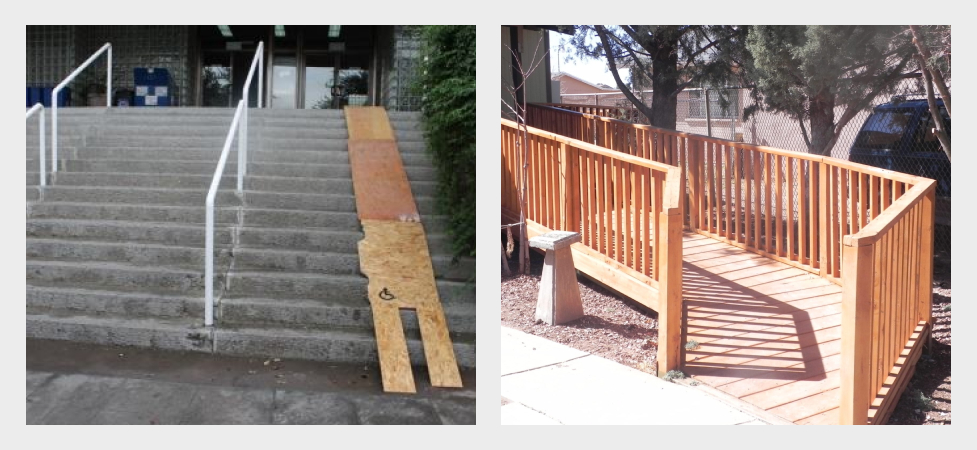
Same differences apply for the web: you either create a button that allows people to view the text in a larger size or you can make the text larger by default making it easily understood and accessible by many.

What needs does the web accessibility address?
The needs that web accessibility means to address include:
- Visual impairment including complete and partial blindness, low vision, poor eyesight, color blindness;
- Motor/mobility issues, such as inability or difficulty to use hands (Parkinson’s, cerebral palsy, stroke, etc): tremors, slowness, low muscle control, among others;
- Auditory impairment: hearing impairment, deafness;
- Seizures, including epileptic seizures;
- Cognitive and intellectual issues: developmental delays, learning difficulties, cognitive disabilities (among all those are dyslexia, dyscalculia, problem-solving and logical difficulties).
Why is web accessibility important?
The web has become a necessity: for education, commerce, employment, health care, entertainment, news, and much more. Web usability ensures that truly anyone has equal access to the information regardless of their abilities. Ensuring everyone has an equal opportunity enables people with disabilities and special needs to participate more actively in society.
There are many other factors, though, that contribute to the importance of web usability: by warranting access to underrepresented communities, corporations can extend their market reach and appeal to a broader population, as well as minimize their legal risk following the laws of jurisdictions which increase their concern over accessibility.
Moreover, web-accessible websites, having employed best practices in design, usability, and SEO, rank higher in the internet searches and sometimes, solve many unanticipated problems because they make developers and engineers and architects think outside of the box.
If you think that no one really benefits from accessibility, then that’s the common misconception — accessibility, in fact, benefits everyone. Consider different browsers, devices, unstable bandwidth and intermittent internet connection, browsing sites in Chinese or any other unfamiliar culture, or opening up a site in a library — all of those conditions do not require any type of disability, yet, these are the factors that should be taken into account while thinking of different users at different circumstances that will access your site.
Speaking of languages and different reading directions, we all know that websites in most European languages are read from left to while, in Arabic and Hebrew it’s the other way around, in Janapenese — some important text might be placed vertically and read from top to bottom. All of these issues need to be accounted for in case your site is accessible in different countries.
At other times, developers and designers need to be aware of other circumstances and personal experiences surrounding the potential user. Among those could be people in extreme circumstances looking to locate information easily and quickly like tourists during a snowstorm, women in abusive relationships, or people browsing for medical advice in public. Incorporating your design with empathy and compassion is critical, respect the privacy of your users and help them preserve it.
Assistive technologies used for web
Before we move any further, let’s describe the assistive technologies currently available for people with special needs, so that you create better websites having the capabilities of those technologies in mind.
Screen readers
Whenever people hear web accessibility, they think ‘screen readers,’ which have long become symbols of web accessibility. A screen reader is essentially a piece of assistive technology that reads the contents of the screen either via audio output or braille output device.
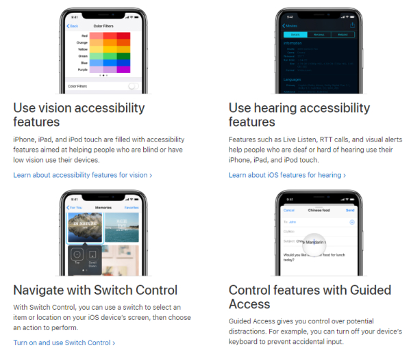
Screen readers used to be very expensive (and actually some still continue to be so) before the advent of the free and open-source software, such as NVDA (NonVisual Desktop Access) for Windows, LSR (Linux Screen Readers), Ocra, among others.
Among other screen readers, you’ll find JAWS (Windows), VoiceOver (Apple), Narrator (Windows), and some others.
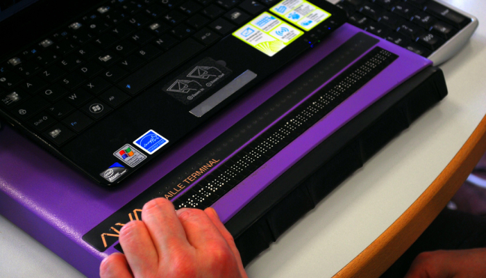
One of the most important technologies to learn here is the refreshable braille display, based on Braille, which is a tactile writing system for visually impaired. A refreshable braille display, also known as a braille terminal, is an electro-mechanical device for displaying braille characters. Visually impaired or deafblind users can use the device to read the text output on a computer screen. The software that actually controls the display is called a screen reader, which gathers the content of the screen from the operating system and then converts it into braille characters. Since the web pages are not only about text, Application Programming Interface (like UI Automation for Windows, VoiceOver for Apple devices, AT-SPI for GNOME) helps readers gain such information as different elements within a window or slidebars, which have to be converted into text to be accessible to users with disabilities.
Hardware navigation
Whereas keyboard navigation is among the many prerequisites for the successful web accessibility practices, hardware navigation is among other things you, as a software and website developer, should be aware of.
So, what are the alternatives for mouse and cursor-based navigation? There are touchpads, touchscreens, upright/vertical mice, rollerball/trackball and foot-operated mice, switch inputs and eye trackers.

Switch inputs usually comprise hardware and software, including mechanical buttons, pressure switches, footplates, electronic and handlebar switches. The switch moves through the options on the screen and then stops as soon as the desired feature is highlighted. Mac’s Switch Control can be enabled through the Accessibility settings, and you can buy those special switches from specialty stores.
Eye trackers are very similar to the sensor or electronic switches but instead rely on a camera to analyze the movement of the user’s eyes and navigate according to those movements. Among those eye trackers are Dwell Control for macOS.

Speech recognition
Speech recognition software operates through spoken commands. Thankfully, we have plenty of those at the moment including Siri, Cortana, Google Assistant, and others. Unfortunately, though, the technology has not progressed enough for those to be fully capable of accomplishing the commands of their users and they are still not yet as dedicated as voice-over interfaces and speech-to-text software.
Screen magnifiers
Screen magnifiers are perhaps the simplest of those technologies but also with the least available capabilities. Usually screen magnifiers potential is limited to zooming functionality, however, it can also have two modes: one for magnifying a particular area on the screen with a click of a mouse, at other times — enlarges the whole screen.
Web Content Accessibility Guidelines (WCAG) 2.0 and 2.1
The WCAG documentation was developed to provide simple and comprehensible guidelines on accessibility that meet the needs of individuals, organizations, and governments. Essentially, the WCAG docs explain how to create accessible markup, content, and design. The latest release of the so-called “success criteria” was issued in 2018 and named as WCAG 2.1, which is the same as 2.0 except for a few minor additions. For the full version of the official guidelines, please check w3.org website. For a quick reference, please see w3.org accessibility checklist.
We’ll address specific issues in accessibility in the following sections on content, design, and HTML.
Content & Design Accessibility
The most important part of designing a website, surprisingly, is thinking conventionally. Using conventions results in a gentler learning curve for new visitors and triggers certain behaviors both in physical and virtual worlds. For example, a button with a power icon is associated with turning something on or off.
Navigation is a crucial part of every website: it reflects the information architecture of your site and gives people a better understanding of where to find the specific information they might be looking for. Make navigation descriptive and concise. Don’t try to be overly creative with naming the sections of your navbar or coming up with alternative navigation that would not only subvert the existing conventions but also baffle the user.
Same conventional considerations apply to links: ensure the links are contrasted to the regular text.
The writing should be well-structured: use clear and concise headings, ensure there are breaks between paragraphs for the reader to rest before continuing reading the text, make lists where possible, and punctuate longer sentences appropriately or break them in chunks.
Now, read the same sentence but in a list.
The writing should be well-structured with
- clear and concise headings;
- breaks between paragraphs;
- lists and bullet points;
- appropriate and grammatically correct punctuation;
- shorter sentences.
The last version was obviously easier to read.
As for the typography, ample font size helps readers with eye-sight problems, so make sure your text is neither too small nor too big. The general recommendation is 16px depending on the used font. While thin type becomes more prevalent, it’s recommended to use it sparingly as it impedes readability on some screens, particularly low-resolution. The line length is recommended to be no longer than 66 characters, otherwise, it’s cumbersome for some readers to follow through and turn their heads as they try to read the long line of text.
Speaking of interactive design, keep in mind that interactive elements on the page should neither be slow nor too fast. Allow users to get control over the interaction. If you really need to use a carousel, give the user an ability to make it stop or skip or customize the timing according to their needs.
If you need to use any type of forms, make them easy and stress-free. Do not attempt at putting too many fields marking all of them with red asterisks or asking for “appropriate format.” You can use JavaScript to convert the entry into an appropriate format. Asynchronous validation can also help users and result in successful form submission.
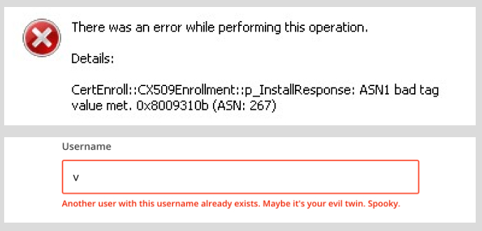
Error messages should be also human-readable. Instead of writing a bunch of numbers, explain what is wrong and how users can fix the problem.
Aim for higher contrast between the color of the background and the typed text, however, do not overdo it, as too high of a contract can result in less readable text. Avoid using different textures and shapes in the background because they can distract readers or make your text completely unreadable.

Provide text alternatives for media files specifying the context or goal of using that particular image without getting overboard with the description. While including infographics or a table might be beneficial for some users, others will find it extremely difficult to understand the data presented in such a format, thus, offer alternative text description of a graph or table in case image has not loaded or the user doesn’t comprehend this type of information.
When including videos, the easiest way to make them more accessible is by providing transcripts with some sort of auditory or relevant visual information that would inform the listeners (readers) of context in which the speech takes place. For example [Mary is in the hall with Jamon, Jared, and Jordan] or [Birds are chirping and music is playing in the background]. Instead of a transcript, you may offer the readers to follow the speech with subtitles and closed captions. YouTube offers automatic subtitles, which are far from perfect but better than nothing. You may also upload your own subtitles if you think you’ve done a better job at transcribing your video.
HTML Accessibility
To connect HTML to the accessibility layer of the operating system, browser makers follow the Accessibility API Mapping standards, so the browser correctly interprets the markup. For the correct interpretation to happen, your HTML should be well structured with the default behaviors not being altered.
Looking at an unstyled HTML document can help a great deal in understanding what the user will see/hear with a screen reader. To disable CSS, you may download Chris Pederick’s Web Developer extension for Chrome, Firefox, Opera, and Safari.
It’s crucial that the context is in complete order with the most important information appearing first because the screen reader will not be able to skim through the page just as fast as the user, who’s perfectly able to see and scroll down with a mouse.
The basic advice for meaningful content and hierarchical structure include
- One
h1element per page; - Usually more than one
h2element per page; h3,h4,h5, andh6headings help break down text further;- Using
ultags for unordered lists andolfor ordered lists where appropriate; - labels and inputs should be paired to ensure accessibility, meaning “each form input should have a unique
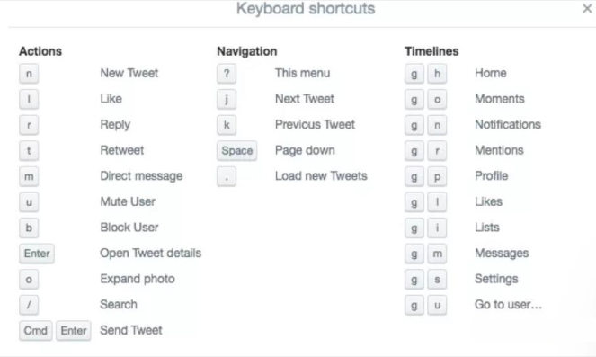
id, and its label should use theidof the input in itsfor=attribute;” - Use keyboard shortcuts (preferably single-key), see {Twitter example} below;
- Allow skip links, so the users can skip the burdensome or excessive navigation and reach content quickly;
- Use keyboard focus and hover styles whenever possible and appropriate (The keyboard focus should be the same as the visual focus otherwise “skip links” are rendered useless: for example, when the user skips the link and moves to the other part of the screen and then tries to type something in — they won’t see it, unless they go back to the keyboard focus. The hover styles are commonly used on interactive elements that change their definitive styles as soon as the user hovers over them. However, do not expect hover styles to be the only ways for showing interaction);
- Always separate structure and style (that is clearly structured HTML and CSS);
- Embrace an idea of graceful degradation, that is building websites for the most capable browsers and adding fallbacks for the less capable. A basic example of this can be displaying an alt text instead of an error message when an image fails to load.
Web Accessibility Initiative—Accessible Rich Internet Applications (aka WAI – ARIA or ARIA)
ARIA is a relatively new standard that was developed in 2014. Complex web applications try to behave like native apps and to do so they make use of custom components or widgets. ARIA allows widgets to use different roles and states, make it more accessible and recognizable by assistive technologies, and enhance the semantic information provided by HTML.
ARIA’s role is used as a layer on top of an existing HTML: a role attribute is therefore prioritized over the implied role of an HTML element. For example,
<div role=””alert>
<p>Your progress has been saved.</p>
</div>
The screen reader will read alert instead of div for the above.
Check out more roles here: Role Categorization
To give more information to assistive technologies ARIA has states and properties, which are usually dynamic and can change throughout the use of a web app. For examples, aria-expanded attribute can be used on a collapsable and expandable menu, and aria-describedby can be used to describe an element even further. Live regions can be used to allow live changes in documents without the user losing focus on their current activity. For example, aria-live means a widget has a live state, aria-live=“off” means a region is not live, aria-live=”assertive” shows that the update should be announced to the user immediately.
<div aria-live=”assertive”>
<p>There’s an emergency in the office, please proceed to the exit immediately!</p>
</div>
Web Accessibility Laws and Regulations
In the United States, it’s the Americans with Disabilities Act (ADA). However, the Act doesn’t presently state any explicit laws for web accessibility. Nevertheless, in 2006 the court ruled that commercial websites like Target are required by the Act and state laws to make their websites accessible (that happened when three visually blind people set a precedent by bringing a lawsuit alongside the National Federation of the Blind (NFB)).
In the UK, it’s the Equality Act that states that any type of information including those on the websites should be accessible to people with disabilities.
Other laws include Section 508 in the US and the European Accessibility Act in the European Union.
Section 508 is an amendment made in 1998 to the US Rehabilitation Act of 1973, which requires disability compliance for governmental organizations or those receiving federal funding. In 2017, the Section received a major update and incorporated specific types and uses of technology and the explicit recommendation to adhere to Level A and Level AA of the WCAG 2.0 guidelines.
The European Accessibility Act is a directive for a legislative framework for accessibility in line with the United Nation’s Convention on the Rights of Persons with Disabilities (CRPD). The European Accessibility Act covers many types of technologies, including websites, ATMs, ticketing machines, and more.
Thanks to WCAG 2.0 and 2.1, the guidelines have become more accessible to a general audience without much of legal jargon and now serve as valuable checks for testing website development and maintenance for accessibility issues.
WCAG is based on four principles, so-called POUR:
- Perceivable — Information and user interface components must be presentable in a way the users can perceive (being able to access);
- Operatable — User interface components and navigation must be operatable (being able to use);
- Understandable — Information and the operation of user interface must be understandable (being able to understand);
- Robust — Content must be robust so it can be interpreted by assistive technologies (being able to interpret).
WCAG has multiple levels of compliance:
• Level A: the lowest (minimum) level of conformance
• Level AA: the middle level of conformance, satisfying both Level A and Level AA criteria
• Level AAA: the highest level of conformance, satisfying Level A, Level AA, and Level AAA criteria
ATAG is the Authoring Tool Accessibility Guidelines, which was created by the W3C for those producing content management systems. ATAG ensures the authoring element of the site is accessible and helps users produce accessible content.
Web accessibility testing and evaluation tools
Before resorting to various accessibility testing tools, you can perform manual testing to assess the accessibility of your page.
The manual web accessibility checker on the W3C website includes the following recommendations:
Page titles
- Check that titles adequately describe the contents of the page and check that the title is different from other pages on the site (it’s
titlewithin thehead)
Alt text
- Every image on your site should have a distinct and succinct alternative text (example,
img src="placeholder.png" alt="here's where the alternative text goes")
Text
- Headings should be of meaningful hierarchy (
h1,h2,h3, etc.) - Color contrast (or luminance contrast): a page needs to have min contrast by default (a contrast ratio of at least 4.5:1 for normal-size text)
- Text resize: ensure all text gets larger proportionately, none of it disappears or gets cut off, nothing overlaps, all buttons and other elements are clearly visible
Interaction
- Keyboard access and visual focus: make sure the user can tab to all elements on the page, check if you can also tab away from elements you tabbed into, check that the visual focus follows your tabbing through elements, ensure all website’s functionality is accessible via keyboard, including drop-down lists and image links.
- Forms, labels, errors: all forms are accessible via keyboard, every form control has a label using
label,for, andid, all labels are positioned correctly for their appropriate languages, required fields are clearly indicated (preferably with words rather than colors or asterisks alone), error messages should be meaningful and fields without errors are populated with the previously entered data - Moving, flashing, or blinking content: check if there’s any information that continuously moves for more than 5 sec and ensure the user can stop the moving, check that no content flashes for more than 3 seconds
- Multimedia: ensure the media player is keyboard accessible and doesn’t start automatically, include captions on videos, transcripts, or audio description.
W3C has a list of numerous available evaluation tools, which you can check here: Web Accessibility Evaluation Tools List
Other web accessibility tips
Set direction of the text on your site using the dir attribute in HTML
<body dir="rtl">
Or in CSS:
body {
direction: rtl;
}
To set the vertical text direction use writing-mode: vertical-rl; in CSS
Do not disable font resizing, instead allow users to zoom into the content on your page on any device:
<meta name="viewport" content="width=device-width,
initial-scale=1.0">
Resources:
Accessibility For Everyone by Laura Kalbag
WAI: Web Accessibility Initiative
Read more from our blog:
Ultimate Reading List for Developers

