Components allow us to break applications into smaller pieces that can be worked on independently. Another good thing about them is that they allow us to reuse logic. Such components will be able to be used in (and with) several other components across the application.
When working on a project, you can simply store the components in a components folder where all pages and components within your project can access it.
But, have you ever found yourself needing a very component you use all the time across different projects? Where you’d have to copy and paste the component’s file or folder into another codebase?
Instead of doing this, you can have your own React library. Tools like Chakra UI and Material UI are React component libraries that can be adopted by any react project.
However, creating a react library is different from how you normally would for a component within a project.
Here’s an example of creating a component in a project:
import React from 'react'

const Input = props => {
  const {label, placeholder} = props;

  return <div>
    <label htmlFor={label}>{label}</label>
    <input id={label} placeholder={placeholder} />
  </div>
}

export default Input
This is just okay for a project-based component. The above is code for development and cannot be used directly in production.
For a library, the components created would have to be processed into production code which can be then adopted by other applications.
As we continue in this article, we’ll learn how to create a component library using a Modal example.
How to create a Modal component Library
For this example, we are going to create a modal component that would be exported from the library.
Firstly, we would need to set up our environment. There are few ways to create a react library but I’ve found create-react-library to be seamless and easily customizable.
create-react-library supports typescript, CSS modules, Babel for transpiling, and Jest to name a few.
Let’s get started building our library.
Install Library
npm i -g create-react-library
This command would install the library globally in your device. If you do not want it this way, here’s an alternative:
npx create-react-library
The above would be executed when you want to start the project. With npx, the library would not be installed globally but used directly (from the source) to create your project folder.
Create the project folder
For this example, we’ll stick with react-modal as the name of our project.
You may want to change the name to something else if you intend on publishing it on npm because npm has unique names for packages.
If you installed the library globally, create a project by doing so:
create-react-library react-modal
Else,
npx create-react-library react-modal
The above command would display a list of options which are:
* The template can be default (which is JavaScript), typescript or custom. For this example, we’ll use default.
After filling in your answers, the library would create your folder, install the required dependencies set up default files for your library. Here’s the tree structure:
react-modal/
├── dist
├── example
├── node_modules
├── package.json
├── package-lock.json
├── README.md
└── src
On install, the library creates an src directory which contains the files for the library, a dist directory which contains the production code of the library and an example directory which contains codes that use the library we are making. This way, we can make changes to the library and simultaneously visualize the result when in use.
See it this way: src directory is the library in development and example directory is the library in production (which uses the codes in the dist directory).
Start server
The only directory that would require a server is the example directory because that is where we preview the result. There’s nothing to preview in the src directory as the library on its own is a utility and not an application.
However, the src/package.json file also has a start script which watches for change in the library and automatically builds the production code of the library in dist.
The following are commands to run to get started:
npm start # start script for the library
cd example # change directory
npm start # start server for example application
Here’s is the webpage on localhost:3000:

The example directory uses the default component created by the library.
Here’s the default component:
import React from 'react'
import styles from './styles.module.css'

export const ExampleComponent = ({ text }) => {
   return <div className={styles.test}>Example Component: {text}</div>
}
Here’s how it is used in example/src/App.js:
import React from 'react'

import { ExampleComponent } from 'react-modal'
import 'react-modal/dist/index.css'

const App = () => {
   return <ExampleComponent text="Create React Library Example :)" />
}

export default App
If you notice in the image above, the component and its stylesheet had to be imported together. That may appear ugly as you would always need those two imports for just one component.
An alternative to this is having inline styles. That is what we would use in the component. Also, you can use libraries like styled-components which support CSS in JS.
Let’s create the Modal component
The features of the modal component are very simple:
- it can contain anything
- it has a close button
- it shows a backdrop overlay when open
Firstly, let’s create the Backdrop component:
// src/backdrop.js
import React from 'react'

const backdropStyles = {
  position: 'fixed',
  left: 0,
  top: 0,
  width: '100%',
  height: '100vh',
  backgroundColor: 'rgba(0, 0, 0, 0.472)'
}

const Backdrop = ({ onClick }) => {
  return <div onClick={onClick} style={backdropStyles} />
}

export default Backdrop
This component receives an onClick prop which we would use to close the modal.
The code for the modal component is as follows:
// src/index.js
import React, { Fragment } from 'react'
import Backdrop from './backdrop'

const wrapperStyles = {
  width: '100%',
  position: 'absolute',
  left: 0,
  top: 0
}

const modalStyles = {
  maxWidth: '500px',
  width: '100%',
  border: '1px solid #ddd',
  backgroundColor: 'white',
  margin: '100px auto 0',
  zIndex: 1,
  position: 'relative',
  padding: '10px'
}

const closeBtnStyles = {
  position: 'absolute',
  right: '20px',
  top: '20px',
  background: 'none',
  border: 'none',
  fontWeight: 'bold',
  fontSize: '20px',
  cursor: 'pointer'
}

const Modal = ({ children, show, onClickCloseBtn }) => {
  return (
    <Fragment>
      {show && (
        <div style={wrapperStyles}>
          <Backdrop onClick={onClickCloseBtn} />
          <div style={modalStyles}>
            <button onClick={onClickCloseBtn} style={closeBtnStyles}>
              X
            </button>
            {children}
          </div>
        </div>
      )}
    </Fragment>
  )
}

export default Modal
The modal component receives three props: children, show and onClickCloseBtn.
* children is the content that appears between `<Modal>` and `</Modal>`.
* show is a boolean which we use to determine if the modal should show or not. Alternatively, this can be handled from the parent component.
* onClickCloseBtn is a function that the parent component handles when the backdrop or close button of the modal is clicked. As you would have guessed, this would be used to close the modal.
Now, let’s use the component in the example directory:
// example/src/App.js
import React, { useState } from 'react'
import Modal from 'react-modal'

const App = () => {
  const [showModal, setShowModal] = useState(false)

  const hideModal = () => showModal && setShowModal(false)

  return (
    <div>
      <h1 style={{ textAlign: 'center', padding: '10px' }}>react-modal</h1>
      <button
        style={{
          width: '200px',
          display: 'block',
          margin: '0 auto',
          padding: '10px',
          background: 'none',
          border: 'none',
          backgroundColor: '#eee',
          fontSize: '20px',
          cursor: 'pointer'
        }}
        onClick={() => setShowModal(true)}
      >
        Show Modal
      </button>
      <Modal show={showModal} onClickCloseBtn={hideModal}>
        <h1>I am a modal</h1>
      </Modal>
    </div>
  )
}

export default App
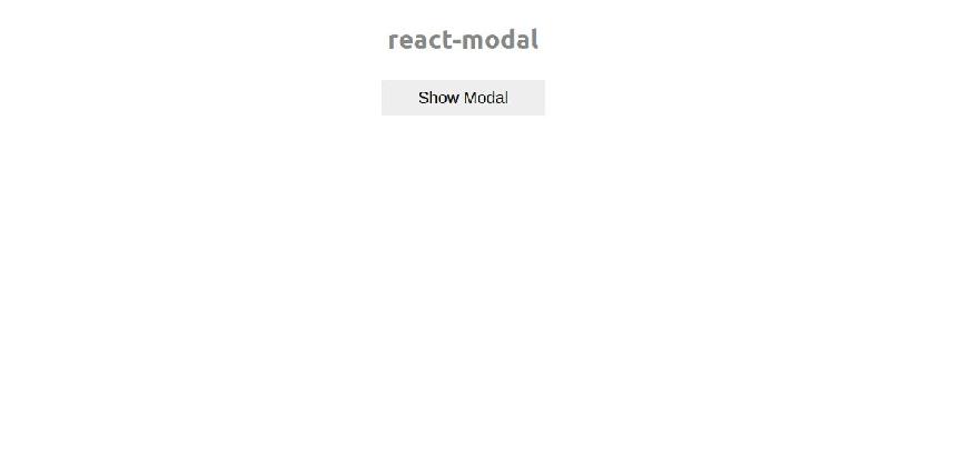
Here’s the result:

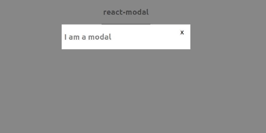
When the button is clicked, here’s the result:

You’ll notice the faded backdrop. On clicking it or the close button of the modal, the modal closes.
Here’s the source code on GitHub
Wrap up
This article explains how to create a react component library using create-react-library and using a Modal example.
Although the example used here was minimal, I hope this gives you a full understanding of how it works and how you can make your own complex and reusable components.


