Positions are used a lot in CSS to describe how elements are placed in a document. Also, they describe how elements behave with the top, left, bottom, and right property. In CSS, there are five positioning properties namely: static, relative, fixed, absolute, and sticky. These properties behave in special ways. In this article, we’ll learn more about the position property and the types.
The position property
The position property of an element specifies the relationship between an element and the document in regards to positioning. For some elements, they are bounded within their parent element and for others, they relate directly with the viewport. The way elements are positioned defines how they work with top, left, bottomand right. When a value of 0 is applied, these properties may either place elements at the edge of the parent element or the edge of the viewport.
Before we get into the five position properties — static, relative, absolute, fixed and sticky — let’s look at what positioned elements are and how they work with the top property.
Positioned elements and the top property
In CSS, some elements can be positioned and can not. The term position means that elements can have a position shift without affecting the surrounding elements. For non-positioned elements, any position shift will affect the elements around them. Here’s what I mean:
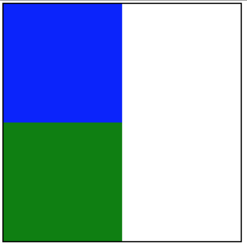
In the above screenshot, we have two blocks within a container. Now, let’s see what it means for an element to change position.
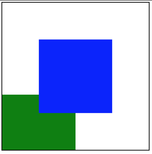
For the above screenshot, the first block is positioned. As you may observe, the block below it is not affected.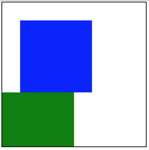
Screenshot showing when one of the block shifts and disrupts the next oneAlong the same distance shift, the first block pushes the second block. You’ll notice that the next block now has a reduced height as it has been pushed a little out of the container. In the first image, the first block is positioned. This means properties like top, and bottom (which are used for positioning elements) can place the block without affecting its environment. But, properties like top cannot be used on non-positioned elements. As you saw in the second block, the block isn’t re-positioned. Instead, it is pushed, thereby affecting the element after it. These examples bring up the following summary: top and bottom are properties used for re-positioning elements, while margin-top and margin-bottom are used for pushing elements. The first image shows a positioned block using top and left while the second image shows a non-positioned block using margin-top and margin-left.
However, don’t be confused, if you use a margin-* property on a positioned block, it will still be pushed. top as a positioning property behaves differently for the different position types. Furthermore in this article, see what those position properties are, and how they behave.
static position
The static property is the default position value for every element. For such elements, they are placed as they are ordered in the document. Ironically, such elements are not seen as positioned elements. This is because they are placed according to the flow of a document, and they cannot leave that flow. This means properties like top cannot work on them. If you apply such property as a style declaration, you would see nothing. However, properties like margin-* can be used on them, and just as we’ve seen few paragraphs above, such properties only push the element, thereby affecting the surrounding elements.
relative position
For relative positioned elements, they retain their order in the document. This means they are bounded by the space they occupy in the document.
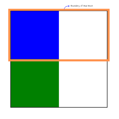
As seen in the image above, the first block occupies the total width (because it’s a block element). But, there’s more to the relative property. As you may have guessed, they can be re-positioned using the top property. When you apply a value of 100px to the top and left the property, it re-positions the element with a top distance of 100px starting from the top boundary and the left distance of 100px from the left boundary as shown below: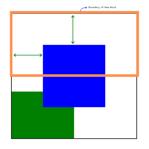
Screenshot showing the distance between the current position and previous position of the relative positioned blue block
absolute position
An absolute value defines an element as positioned. The difference between this and the relative position is that:
- the boundary for absolute elements is different
- absolute elements are removed from the flow of the document
Absolute elements can either be bounded by the parent element or the viewport. The viewport is the default boundary. The parent element can only become the boundary when it has a relative position. Remember that static (the default position) elements cannot be positioned. Therefore, they cannot serve as a boundary. But when you apply a position of relative to an element, it can serve as a boundary for absolute positioned elements. Let’s say the blue block has an absolute position with a left of 100px, a right of 100px, and a relative parent, here’s an illustration to visualize its boundary:
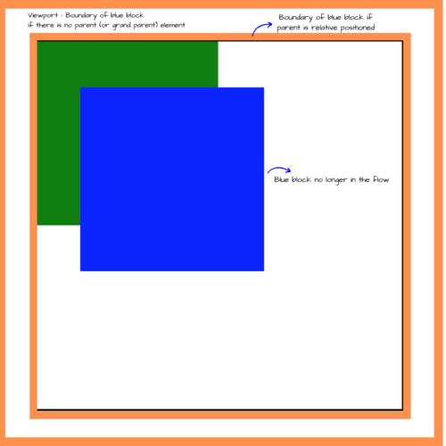
As you’d notice, the green block moves to the top of the parent element. This is because the blue block is removed from the flow. The surrounding elements no longer respect the block as it seems it is invisible. However, in the DOM, the blue block comes before the green element. It only loses its order visually. The blue block respects the closest relative parent it can find as its boundary, else, respects the viewport as the boundary. If a value of 100px is applied to the top property, similar to the relative, value, it moves a distance of 100px from the top of the boundary.
fixed position
fixed positioned elements are similar to absolute elements. They are removed from the flow of the document but contrary to the latter, they do not respect relative parents as boundaries. They have only one boundary — the viewport. When you apply a value of 100px to the top property, the element moves 100px from the top of the viewport.
sticky position
sticky positioned elements are a bit tricky. They are a combination of the fixed position and the relative position. The element behaves like a relatively positioned element and at some point, becomes a fixed position. That point has to be explicitly specified, else, it behaves completely like a relative element. The sticky element is bounded by the parent element. To get a better understanding of this property, let’s assume an element has the following style declaration:
.element {
    position: sticky;
    top: 0;
}
The above declaration treats the element as position relative, but as soon as the element reaches the top boundary, it behaves as a fixed element. It remains fixed until the parent element is no longer visible in the viewport.
This means:
- relative when mounted
- fixed when a specified position condition is met (like
top: 0) - relative when the parent is no longer in view
This Codepen demo is a demo from CSS Tricks which shows how the sticky property works. To see it in action, scroll down the demo webpage and see how the elements are attached to the top while the parent is in view.
Recap
The position property is used to define how an element is placed on a document. The default position for every element is static and the irony of this is that static elements are not considered positioned. Static elements are placed as they appear in the DOM and as such, top does not have any impact on them. The other position types make elements “positioned” which makes it possible to use properties like bottom on them.
In this article, we’ve seen an in-depth explanation of position as used in CSS with the 5 position types. static is the only non-positioned property. The others are, but, they behave differently with positioning properties like top, bottom, left and right.
Notes
- The
staticproperty only places an element as specified in the source code - The
relativeproperty bounds an element by the space it occupies in the webpage. - The
absoluteproperty bounds an element by the closest parent element or by the viewport and also removes the element from the flow visually - The
fixedproperty behaves likeabsolutebut bounds an element by the viewport alone - The
stickyproperty is a combination ofrelativeandfixedwhich keeps an element relative until a position condition is met, all these while the parent is visible.
Also, note that margin-* properties behave the same way for sticky, static, and relative elements — push them from their current position to another while affecting the surrounding elements — as they retain their flow in the document. For fixed and absolute which lose their order, margin-* works the same way but does not affect any other element.
For further reading, I explained 5 CSS properties that are incompatible in this article. In it, I discuss how positioned and non-positioned elements affect the style declarations you can use with such elements.


