

What is CSS Masking
Masking in CSS is the process of hiding or partially hiding images or graphical elements. It is a graphical operation that hides a partial portion of an image or object. It allows you to use an image as a mask layer with different opacity levels. This implies that you can use an Image, an SVG, or a gradient as your mask to create a beautiful visual effect.
In CSS, masking is implemented using a mask-image property to provide an image to be used as the mask. When it’s 100% black the Image will be visible. When it’s 100% transparent, it will hide it, and when it’s anything in-between, it will partially mask the Image. In this article, we will explain how to use the mask-image property in CSS and also show you three ways to use an image as a mask layer which are:
- Masking with Image
- Masking using Gradient
- Masking with SVG
Before that, there is some browser compatibility with CSS. Some browser doesn’t fully support the standard CSS masking property. You will have to prefix -webkit- to the specific property for it to be browser compatible. You can also check Can I use CSS Masks? for the browser support for CSS masks.
When using masking in CSS, it’s advisable to correct what will happen if masking is unavailable with feature queries to detect support for mask-mage or -webkit-mask-image. While making provision for a readable fallback adding your masked version.
@supports(-webkit-mask-image: url(#mask)) or (mask-image: url(#mask)) {
  /* insert code for your mask-image here. */
}
Masking Using Gradient
Masking an image with a gradient can give a beautiful and nice-appealing look to your image. A linear gradient can mask an image area from transparent to black. For example, in the image below, the first image is our default image without a mask. While the second image has a linear gradient applied to the mask-image value:
This the CSS mask-image rule used for the second image in the diagram below here:
.firstMask {
    -webkit-mask-image: linear-gradient(to bottom, transparent 10%, black);
   mask-image: linear-gradient(to bottom, transparent 10%, black);
}
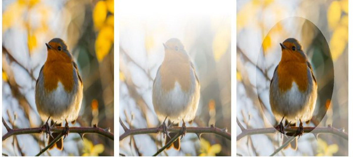
You can also be stylistic and creative with the masking by using any gradient type. The third image in the diagram above uses a radial gradient in creating a circular mask.
.secondMask {
    -webkit-mask-image: radial-gradient(
      circle at 50% 50%,
      black 50%,
      rgba(0, 0, 0, 0.6) 20%
    );
    mask-image: radial-gradient(
      circle at 50% 50%,
      black 50%,
      rgba(0, 0, 0, 0.6) 20%
    );
}
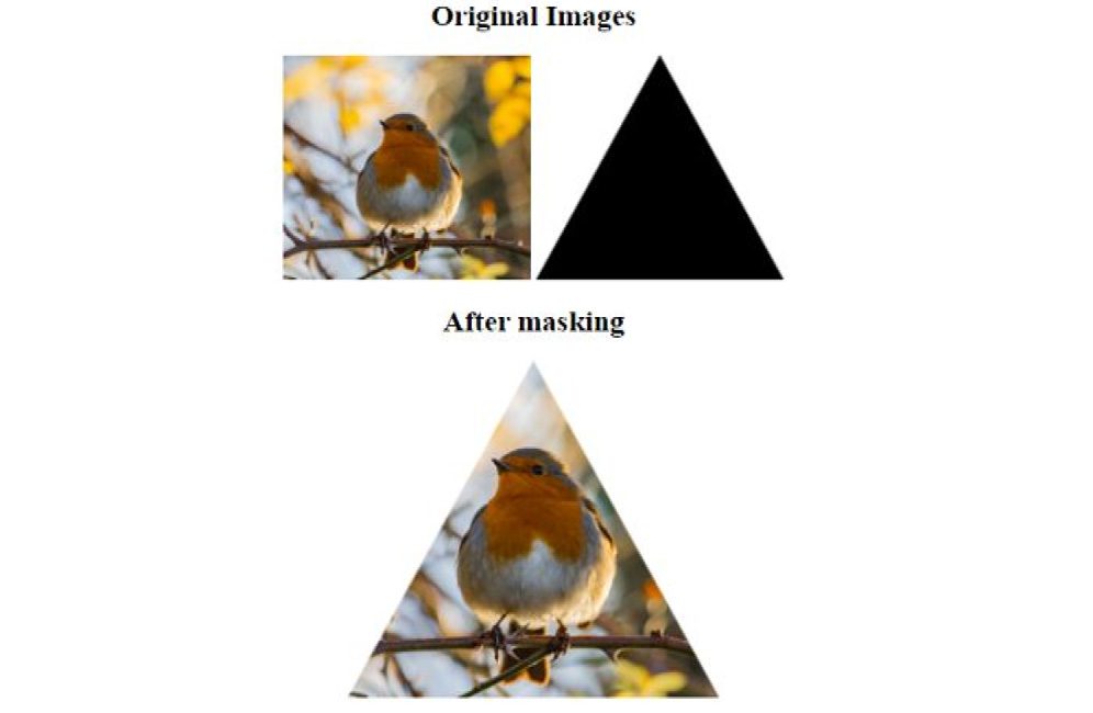
Masking with Image
To mask an image, a fully transparent area will make the image invisible while the part with a little transparency will allow the original to be visible.
The first image is the original image in the below example, while the second image is the image mask itself. The third image applies to the mask below.
Below is the CSS style applied to the mask:
 #masked {
        width: 300px;
        height: 300px;
        -webkit-mask-box-image: url("Img/mask.png");
        mask-image: url("Img/mask.png");
      }
Here we specified the mask-image url() which works similarly to the way the background-image property works.
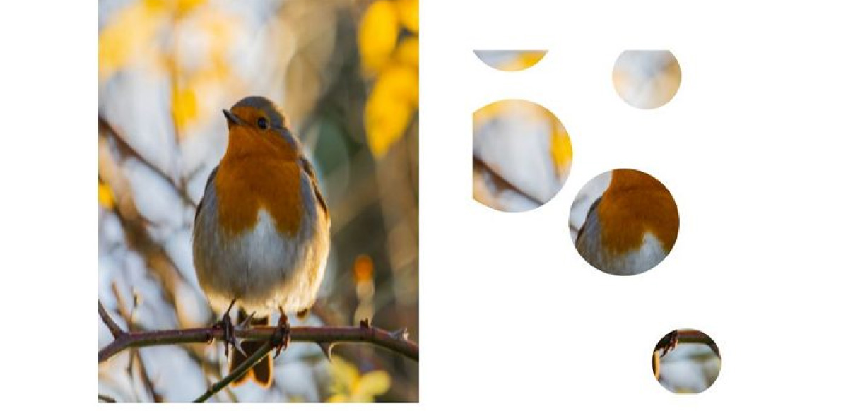
Masking with SVG
If you love SVG as I do. Instead of using an image as the mask, you can define image masks with the SVG mask element.
To achieve this, we will define the image as part of an SVG element itself:
<svg
    width="300px"
    height="450px"
    viewBox="0 0 400 700"
    class="mask-svg"
    style="vertical-align: top;"
>
   <defs>
        <mask id="svg-mask">
          <circle
            id="Oval"
            fill="#FFFFFF"
            cx="50.3643417"
            cy="250.414611"
            r="81.4648437"
          ></circle>
          <circle
            id="Oval"
            fill="#FFFFFF"
            cx="311.578293"
            cy="560.568392"
            r="50.5976606"
          ></circle>
          <circle
            id="Oval"
            fill="#FFFFFF"
            cx="220.623423"
            cy="350.467234"
            r="80.5878906"
          ></circle>
          <circle
            id="Oval"
            fill="#FFFFFF"
            cx="55.5"
            cy="60.5"
            r="63.5"
          ></circle>
          <circle
            id="Oval"
            fill="#FFFFFF"
            cx="253.61"
            cy="130.56"
            r="50.42"
          ></circle>
          <circle
            id="Oval"
            fill="#FFFFFF"
            cx="60.14"
            cy="250.41"
            r="85.46"
          ></circle>
        </mask>
      </defs>
      <image
        xlink:href="Img/bird.jpg"
        width="500"
        height="700"
        mask="url(#svg-mask)"
      ></image>
</svg>
Conclusion
I hope you really enjoy working through this article. We have learned how to use mask in CSS to hides part of the element it is applied to. We covered how masking works with Image, Gradient, and SVG. Also kindly check this reference below to learn more in-depth on masking.
https://developer.mozilla.org/en-US/docs/Web/CSS/CSS_Masking
https://developer.mozilla.org/en-US/docs/Web/CSS/mask
If you have any questions, kindly engage me in the comment below.