
CSS Flexbox
Imagine developing amazing web layouts that smoothly adjust to any screen size or device, laptop or mobile, without the necessity of sophisticated code. Welcome to the world of CSS Flexbox, a layout module that aids in the transformation of modern application design. In this article, I’ll go over flexbox and how it can be utilized to create flexible designs.
Overview of CSS Flexbox
Flexbox, also known as Flexible Box Layout, is a CSS layout module that has transformed the approach to responsive design and content arrangement. Flexbox provides a more efficient and effective method for aligning, distributing, and ordering items within a container. This eliminates the need for us developers to utilize floats, tables, or other less-than-ideal solutions that used to give us grief.
Flexbox is the ability to build a flexible container that can change the size and position of child components, often known as flex items. With characteristics and values that allow us to manage the orientation, alignment, order, and size of these elements within the container, both horizontally and vertically.
CSS Flexbox key concepts
There are a few ideas you need to grasp before you can begin to work with a flex box effectively, and these ideas are:
1. Flex container
2. Flex items
3. Main Axis and Cross Axis
4. Flex Properties
Flex Container
This is the container for and controller of the layout of its child components, which are called flex items. If you provide an element the display: flex; property, it will act as a flex container and transform its direct descendants into flex items. This is a crucial idea that will be used often when working with Flexbox.
Flex Items
The arrangement of the flex items that make up a flex container offspring is determined by the container’s properties. Depending on the confines of the container, these malleable components may be scaled, rearranged, and aligned in a variety of ways.
Let me provide a simple example to show how a flex container is related to the flex items it contains.
<!DOCTYPE html>
<html lang="en">
<head>
    <style>
        /* Set the display property of the container to "flex" */
        .flex-container {
            display: flex;
        }

        /* Apply basic styles to flex items */
        .flex-item {
            background-color: lightblue;
            padding: 15px;
            margin: 10px;
            border: 1px solid black;
            text-align: center;
        }
    </style>
</head>
<body>
    <div class="flex-container">
        <div class="flex-item">Item 1</div>
        <div class="flex-item">Item 2</div>
        <div class="flex-item">Item 3</div>
    </div>
</body>
</html>
The code and picture above and below respectively depict the contents of a flex container, which are flex items.

Main Axis and Cross Axis
There are two axes that Flexbox uses to function: the main axis and the cross axis. Flex items are often arranged along one of two axes: the main axis, which may be thought of as the “row” or “column” orientation, and the cross axis, which is perpendicular to the main axis. The flex container’s ‘flex-direction’ attribute controls the alignment of these axes.
Let’s modify our earlier code by adding some properties to demonstrate.
<!DOCTYPE html>
<html lang="en">
<head>
    <style>
        .flex-container {
            display: flex;
            /* Define the flex-direction (main axis) */
            flex-direction: row; /* Change to 'column' to see the difference */
            /* Align items along the main axis */
            justify-content: space-between;
            /* Align items along the cross axis */
            align-items: center;

            font-size: 3rem;
            border: 1px solid black;
        }

        .flex-item {
            background-color: lightblue;
            padding: 15px;
            margin: 10px;
            border: 1px solid black;
            text-align: center;
        }
    </style>
</head>
<body>
    <div class="flex-container">
        <div class="flex-item">Item 1</div>
        <div class="flex-item">Item 2</div>
        <div class="flex-item">Item 3</div>
    </div>
</body>
</html>
Depending on the `flex-direction` value we should get one of these result.

Flex Properties
The flex container and flex items both have access to Flexbox’s extensive property set. Several of them, including display, justify-content, and align-items, have previously been used. Developers may easily implement a wide variety of layout situations thanks to these parameters, which elegantly control the size, order, and alignment of flex objects inside the container.
Properties for containers and properties for items make up the bulk of the flex properties.
I’ll list a few of the flex container’s property:
- display: Turn an element into a flex container by setting its display property to
flexorinline-flex. This transforms the element’s immediate children into flex items and provides developers with more freedom when laying up their pages. - flex-direction: This controls the alignment of flex items and the direction of the main axis. Depending on your design requirements, you may choose among
row(the default),row-reverse, column,andcolumn-reverse. - flex-wrap: When there isn’t enough room on the primary axis, flex objects may wrap into additional lines, which you can adjust using flex-wrap. You can choose the best match for your layout from the three available options:
nowrap(the default),wrap, andwrap-reverse. - justify-content: This property allows you to specify the main axis alignment for flex elements.
Flex-start(the default),Flex-end, Center, Space-between, Space-around,andSpace-evenlyare just few of the parameters available to help you get the exact look you want for your design. - align-items: Use this property to set the alignment of flex items along the cross axis. You may construct attractive and well-organized layouts by choosing from the following options:
stretch(the default),flex-start, flex-end, center,andbaseline. - align-content: This properties centers the flex lines in multi-line containers that have additional space in the cross axis. To obtain the desired impact in your design, choose either
stretch(the default),flex-start, flex-end, center, space-between, space-around,orspace-evenly.
Here are a few properties we have for the flex items.
- flex-grow: This is a property that tells the container how much more space a flex item may take up in comparison to its other siblings. Unless otherwise provided, the default value of 0 signifies that no objects will expand in size.
- flex-shrink: When available space in a container is restricted, the
flex-shrinkattribute specifies how much a flex item should contract in comparison to other things. By default, Flex objects will decrease in size proportionally to fill the available space. - flex-basis: This property determines the primary size of a flex item before it is scaled up or down using the
flex-growandflex-shrinkattributes, respectively. The default option isauto,which instructs the browser to use the item’s content to decide its size. - flex: Flex combines
flex-grow,flex-shrink, andflex-basicinto a single shorthand property. There will be no expansion, no contraction, and the basis will be set automatically if you leave this property’s default value of0 1 autoin place. - order: To specify the order in which flex elements are presented within a flex container, use the
orderproperty. You may easily reorganize Flex components by sorting them by order value, with lesser order values showing up first.
Please allow me to utilize some of these features to demonstrate how it works.
<!DOCTYPE html>
<html lang="en">
<head>
    <meta charset="UTF-8">
    <meta name="viewport" content="width=device-width, initial-scale=1.0">
    <style>
        .container {
            display: flex;
            justify-content: space-between;
            border: 1px solid black;
            padding: 10px;
            font-size: 3rem;
        }

        .item {
            background-color: lightblue;
            border: 1px solid black;
            padding: 20px;
            text-align: center;
        }
    </style>
</head>
<body>
    <div class="container">
        <div class="item" style="flex: 2 1 100px; order: 2;">Item 1</div>
        <div class="item" style="flex: 1 1 200px; order: 1;">Item 2</div>
        <div class="item" style="flex: 1 2 150px; order: 3;">Item 3</div>
    </div>
</body>
</html>
To demonstrate the adaptability of CSS Flexbox, I’ve given each flex item a unique value for its item property in the code above.
In the first item, I have set the flex property to 2 1 100px. The flex values are 2 for grow, 1 for shrink, and 100px for the basis. If there is excess room, Item 1 will expand at a rate double that of the other items, making it more noticeable. In addition, I’ve moved it down to position #2 in the window’s list using the order property.
The flex property of Item 2 has been set to 1 1 200px. A flex-grow value of 1, a flex-shrink value of 1, and a flex-basis of 200px would be the result of these settings. Item 2 will expand and contract at the same pace as other items with the same values with these parameters. I’ve set the order property to 1 so that it appears as the first item on the list.
Item 3 is the last one, and its flex property has been set to 1 2 150px. A flex-grow value of 1, a flex-shrink value of 2, and a flex-basis of 150px are the results of these settings. When storage is at a premium, the volume of Item 3 may be reduced by a factor of two in this arrangement. With an order value of 3, this element will appear after all others on the page.
This example shows how to utilize flex properties to modify the dimensions and placement of flex elements within a flex container.
Here is what my result looks like.

Common use case of Flexbox
Flexbox is a strong and flexible layout element that has drastically altered the face of current web design. Flexbox is an essential tool for web designers, and here are some of the most typical uses for it:
- Flexbox makes it easier to make navigation bars that scale gracefully to different screen widths. I can simply adjust the distance between and alignment of navigation elements inside the container using characteristics like
justify-contentandalign-items, resulting in a streamlined user experience. - Flexbox excels at aligning form labels and input elements, particularly for horizontal alignment, making it ideal for use with form controls. By applying
display: flex; to a form group container, I can ensure that labels and input fields stay in the same relative position, regardless of the size of their contents. A aesthetically pleasing and practical layout is the end product. - Flexbox is a game-changer when dealing with media items like picture and text combinations. By making use of flex features, the picture and text will always be properly aligned, no matter the size or aspect ratio of the image.
- Flexbox makes it easy to arrange and distribute content vertically and horizontally inside a container. This is very helpful for providing the design a professional appearance by centering information inside parent containers, such as modals or call-to-action sections.
- Card-based layouts are common in contemporary web design, and Flexbox is the best option for them.
Flex-wrapallows me to make a responsive grid of cards that automatically adjusts to different screen sizes, which improves the grid’s usability for people with disabilities. - Floats and other less versatile methods are now unnecessary thanks to Flexbox’s convenient way to creating multi-column layouts. With
flex-growandflex-basis, I can make columns whose widths adapt to the amount of space between them and the size of their contents. - The order attribute in Flexbox lets me rearrange the DOM components within a flex container without touching the markup. This function is very important in responsive designs, as the display order of information may need to adapt to the viewing device.
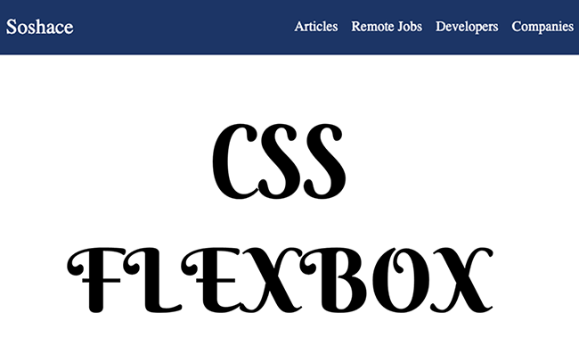
Building a navbar using Flexbox
One common use of flexbox in modern online applications is the ubiquitous navigation bar. This crucial feature typically has two parts: the title and the navigation links that allow visitors to hop from one page to another. The title usually appears on the left of the navigation bar, while the links themselves extend to the right. This can easily be done with use of our flex properties.
let’s do this.
<!DOCTYPE html>
<html lang="en">
<head>
    <style>

        /* Define the nav-bar styles */
        .nav-bar {
            display: flex;
            justify-content: space-between;
            align-items: center;
            background-color: #1c3565;
            padding: 0.5rem;
        }

        .nav-logo {
            color: white;
            text-decoration: none;
            font-size: 1.5rem;
        }

        .nav-links {
            display: flex;
            list-style-type: none;
        }

        .nav-links li {
            margin-left: 1rem;
        }

        .nav-links a {
            color: white;
            text-decoration: none;
        }
    </style>
</head>
<body>
    <nav class="nav-bar">
        <a href="#" class="nav-logo">Soshace</a>
        <ul class="nav-links">
            <li><a href="#">Articles</a></li>
            <li><a href="#">Remote Jobs</a></li>
            <li><a href="#">Developers</a></li>
            <li><a href="#">Companies</a></li>
        </ul>
    </nav>
</body>
</html>
And here is what my simple navbar looks like.

Conclusion
To sum up, Flexbox is an extremely effective and flexible CSS layout element that has revolutionized the way we developers develop mobile-friendly and user-friendly websites. Without resorting to hacks or workarounds, modern, adaptable, and dynamic layouts can be made with ease because to its ability to align, distribute, and organize items with ease.
It’s crucial for me to learn Flexbox’s capabilities and attributes as its use grows among web designers and developers. By fully embracing Flexbox, I can make websites that are easier to update, more efficient, and more user-friendly across a wide range of screen sizes and devices. As a designer, this not only makes me happy, but it also opens the door to better online usability and accessibility in general.
Here is a link to the learn more about the Flexbox layout module.