In this article, we’ll look at some of the basics of responsive web design, its prerequisites, benefits, and challenges, as well as provide the list of additional resources that might be helpful for those willing to learn more about the approach.
What Is Responsive Web Design
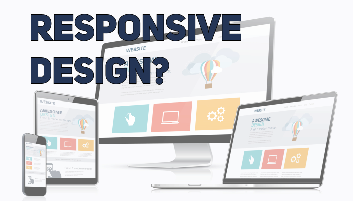
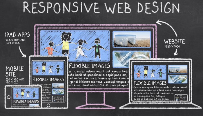
Responsive web design is an approach to web design that makes web pages display properly on any device, window, or screen size. Whether you’re building a business website or learning how to start a blog, content representation and performance are critical to ensure usability and satisfaction of the users. A website designed responsively adapts the layout to the appropriate environment by using a system of grids, flexible images, and CSS3 media queries.
So how exactly does the adaptation work? The fluid grid concepts require page element sizing to be in relative units (like percentages) rather than in absolute units (like pixels). Flexible images are also sized in relative units to prevent them from displaying outside their containing element. Based on the characteristics of the device, media queries allow the page to use different CSS style rules; and responsive layouts automatically adjust to any device screen size.
Responsive web design is an example of user interface plasticity, which basically means the user interface can withstand variations of both the physical characteristics of the system and the environment while preserving usability. To see responsive design in action, you might want to check the Media Queries library with a collection of design resources and examples of websites that use media queries and responsive design principles to create web pages that look perfect on any device.
History
Surprisingly enough, the history of responsive web design goes way back to 2001, when Audio.com featured a layout that adapts to the browser viewport. Then CSS3 media files were ready in 2009, and several related concepts like “flexible” and “elastic” had already been popping up around the web at the time. Thanks to Ethan Marcotte and his article in A List Apart, the term “responsive web design” was finally born in 2010. By 2011 Marcotte had written a book called Responsive Web Design, where he described in greatest detail the theory and practice of the new coined definition. The term was quickly adopted by other similar web development and design enthusiasts and professionals, who stellified the trend and promoted it en masse. The year 2013 was officially recognized as the Year of the Responsive Web Design. Since then, everyone seemed ready to adopt the concept, having recognized its numerous benefits and importance.
Setting Up Responsive Web Design for Your Page

To make a responsive web site, first, you’ll need to add the following <meta> element in all pages of your web site:
<meta name="viewport" content="width=device-width, initial-scale=1.0">
And when you do, you’ll set up the viewport of your page, which will give instructions on how to control the page’s dimensions and scaling.
There are several ways to set up responsive images which will look nice on any device:
-
- With the CSS width property set to 100%. For example,
<img src="img_one.jpg" style="width:100%;">
- With the max-width property set to 100%. This way, the image won’t scale up larger than its original size. For example,
<img src="img_one.jpg" style="max-width:100%;height:auto;">
- With the HTML
element that allows you to define different images for different browser window sizes. For example, <picture> <source srcset="img_smallpot.jpg" media="(max-width: 600px)"> <source srcset="img_pot.jpg" media="(max-width: 1500px)"> <source srcset="pot.jpg"> <img src="img_smallpot.jpg" alt="pot"> </picture>
To set up a responsive text size, use “vw” unit, which stands for viewport width. 1vw is 1% of viewport width, which is the browser size. For example,
<h1 style="font-size:12vw">My page</h1>
To define completely different styles for different browsers, you’ll have to use media queries. For example, div elements displayed horizontally on larger screens, and vertically – on small screens:
<style>
.left, .right {
  float: left;
  width: 20%;
}

.main {
  float: left;
  width: 60%;
}

@media screen and (max-width: 800px) {
  .left, .main, .right {
	width: 100%; /* The width is 100%, when the viewport is 800px or smaller */
  }
}
</style>
However, if you don’t like to play around with all the media queries and sizes by yourself, there are a lot of free CSS frameworks available that will make the job easier for you. For example, there’s a responsive style sheet, like W3.CSS and Bootstrap framework (that uses HTML, CSS, and jQuery).
To get in-depth info on how to apply responsive design principles to your webpage, check out the Google Developer’s tutorial from Pete LePage here.
Challenges and Benefits
Let’s first point out the benefits of the responsive design approach, although some of those might be a little too obvious:
- Makes easier for users to share content across devices with a single URL
- Requires less time maintaining pages, because there’s a single page for every device
- Responsive websites rank higher on Google
- Reduces the possibility of mistakes
- Requires no redirection for users to have a device-optimized view
Now, for the challenges:
- If you’re using large sized media files, it will drastically slow down the loading of your page on a mobile device with poor network coverage or less physical memory. To fix this issue, you’ll need to create a separate set of images for mobile devices with lower resolution and remove unnecessary videos.
- Complicated navigation needs to be simplified for mobile devices. For example, you’ll need to create a fixed header, add “scroll to the top,” perform additional manipulations with the menus and sub items and arrange them in such a way so the user won’t get lost navigating your site.
- Accommodating screen sizes of numerous devices can be a challenging task. In order to approach the problem, you’ll need to write a minimum and maximum device width in media queries instead of just a fixed screen width. Also, keep on testing your site and observe the changes that happen in the market to quickly respond and accommodate any new developments.
- Hiding and removing content for mobile devices can also be challenging and time-consuming. But unfortunately, there’s no solution for that one, you really need to get rid of some of the irrelevant or less important content. But at the same time, you still should try and create a rich experience for the user with the minimum amount of tools and content available.
- Showing data on small screens is particularly demanding and requires additional attention.
- The responsive design certainly means a longer testing period.
Other Approaches
Responsive web design with server-side components (RESS) is believed to provide a user experience that’s better optimized for mobile devices. The key principle behind RESS is that server-side dynamic CSS like Sass access a server based API which handles the device differences and capabilities database to improve usability. However, since RESS requires more than just client-side logic, it’s quite costly to implement.
Conclusion
Responsive web design is no longer a privilege or a whim, it’s a necessity for all web pages. If you’re willing to learn more about various aspects of responsive web design, here’s another good source for with a collection of articles and tutorials on the subject: Responsive Resources on Github
- With the CSS width property set to 100%. For example,


Marina, bravo! Great post! Now I’m studying the topic of adaptability, your post is valuable information for me.
I just recently learned about responsive web design while working on a project. It’s all about creating websites that adapt to different screen sizes, whether it’s a phone, tablet, or computer. This way, the site looks good and works well no matter the device. If you’re curious about web design agencies, check out https://limeup.io/blog/webdesign-agenturen/ It’s been eye-opening to see how important responsive design is for user experience today.