Grid layout is one the most powerful features available in modern CSS. Using grid layout can help you build complex, responsive and amazing html layouts without any external css frameworks (i.e. bootstrap). With grid layouts you can structure responsive html sites quickly and easily. In this article we will go over everything you need to know about css grids.
The Basics of CSS Grid
Let’s jump directly in the code. Let’s make some simple markup with html first. You can also find the complex code for this section in this link
<div class="container">
  <header>Header</header>
  <aside>Aside 1</aside>
  <section>Section</section>
  <aside>Aside 2</aside>
  <footer>Footer</footer>
</div>
Above we created a header, two asides and a footer element and wrapped them in a container element. We will apply a background color to all the elements inside the container element and increase the font size.
.container > * {
  background: aquamarine;
  font-size: 30px;
}
This is how our page will look like.

Now let’s add some grid magic.
.container {
  display: grid;
  grid-gap: 5px;
  grid-template-areas:
    "header"
    "aside-1"
    "aside-2"
    "section"
    "footer"
}

/* Assign grid areas to elements */
header {
  grid-area: header;
}

aside:nth-of-type(1) {
  grid-area: aside-1;
}

aside:nth-of-type(2) {
  grid-area: aside-2;
}

section {
  grid-area: section;
}

footer {
  grid-area: footer;
}
Let’s walk through this code snippet.
First, we defined `display:grid` which will enable grid layout, then we applied a gap in the grid elements with `grid-gap`.
Next we assigned a grid-area name to each of the html elements. Inside our `container` class we can define how we want our html template to look with the `grid-template-areas` property. Notice how the grid template area is arranged.
grid-template-areas:
    "header"
    "aside-1"
    "aside-2"
    "section"
    "footer"
The order of the elements are different from our markup. However, it will display the html elements in this order.

The next step is to make our page responsive. We want a different layout for a bigger screen. CSS grids makes it really easy to work with media queries and to create responsive layouts. Here’s the code:
@media (min-width: 670px) {
  .container {
    grid-template-areas:
      "header  header  header"
      "aside-1 section  aside-2"
      "footer    footer    footer"
  }
}
All we had to do is to re-order our `grid-template-areas` inside a media query. And that’s all we really have to do.

Find the full code for this part here 👇
Grid Columns and Rows
Let’s take a look at how we can organize columns and rows with css grid. Let’s start with some markdown.
<div class="container">
  <div class="item">One</div>
  <div class="item">Two</div>
  <div class="item">Three</div>
  <div class="item">Four</div>
  <div class="item">Five</div>
  <div class="item">Six</div>
</div>
Let’s add some basic css to this.
.container {
  display: grid;
  height: 100vh;
  grid-gap: 10px;
}

.item {
  background: lightcoral;
}
We applied the grid and a gutter gap to all the elements. We also gave all the items a background color. Now let’s add some columns. We will use the grid-template-columns property.
.container {
    display: grid;
    height: 100vh;
    grid-gap: 10px;
    grid-template-columns: 100px 200px auto auto;
}
And just like that we have columns applied now. We specified that our first column is 100px, second 200px. Since we applied auto in 3rd and 4th column the remaining screen length will be divided in half between them.
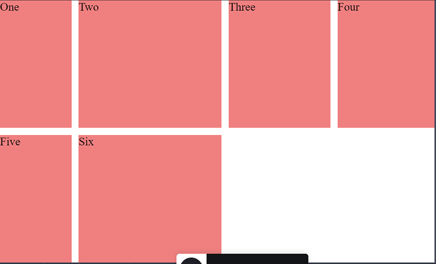
We can see that there is a gap in our page now. What if I want to move `column six` under `three` and `four`? We can use the `grid-column-start` and `grid-column-end` properties for this.
.item:nth-of-type(6) {
  grid-column-start: 3;
  grid-column-end: 5;
}
Notice we used `grid-column-end: 5`, the value 5 is referring to the column line. The fourth column ends in the 5th line of the grid. `grid-column-start` and `grid-column-end` values refer to the grid lines.
If you find grid lines value to be confusing you can also use span. For example the code below will produce the same result.
.item:nth-of-type(6) {
  grid-column-start: 3;
  grid-column-end: span 2;
}
With `span 2` we are specifying that we want our div to take up to two slots in the grid. Now let’s say I want to expand `column two` to fill the empty space below. We can do that easily as well with `grid-column-start` property.
.item:nth-of-type(2) {
  grid-row-start: span 2;
}
We used span along with ` grid-row-start` to specify that we want the div to take up two slots horizontally.
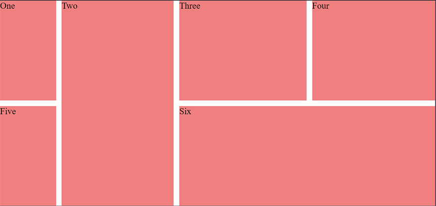
As you can see we are already able to build quite complex layouts with a handful number of css grid properties.
You can find the complete code for this section in the link below 👇
Using grid-templates effectively
Now let’s dig deeper into grid-templates. In this section we will discuss how to create different layouts for different screen sizes.
Let’s start with some markup.
<div class="container">
  <header>header</header>
  <aside>Left</aside>
  <section>Section</section>
  <aside>Right</aside>
  <footer>Footer</footer>
</div>
Let’s apply some basic css to get started with our view.
.container {
  display: grid;
  height: 100vh;
  grid-gap: 10px;
}

.container > * {
  background: coral;
  display: flex;
  justify-content: center;
  align-items: center;
}
We applied some basic background color to our elements. As you can see from the code above we are also using flex property. We can combine flex and grid together. In this particular example we are aligning the contents in the center using the `flex` property. At this point our page looks like this
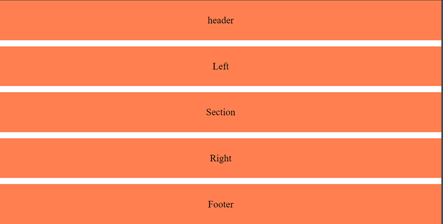
Let’s say for our mobile view we want the `section` after the header. Then we want our right below the section. So let’s define our variables for grid-area and create the layout.
.container {
  display: grid;
  height: 100vh;
  grid-gap: 10px;
  grid-template-areas:
   "header"
    "section"
    "right"
    "left"
    "footer"
}

aside:nth-of-type(1) {
  grid-area: left;
}

aside:nth-of-type(2) {
  grid-area: right;
}

section {
  grid-area: section;
}

footer {
  grid-area: footer;
}

header {
  grid-area: header;
}
As you can see in our ` grid-template-areas` we have header then section then right and then left. This will view our page as we wanted. Additionally we want our section to be larger than left and right. To make this happen we can add `grid-template-rows` property.
.container {
  display: grid;
  height: 100vh;
  grid-gap: 10px;
  grid-template-areas:
    "header"
    "section"
    "right"
    "left"
    "footer";
  grid-template-rows: 1fr 6fr 2fr 2fr 1fr;
}
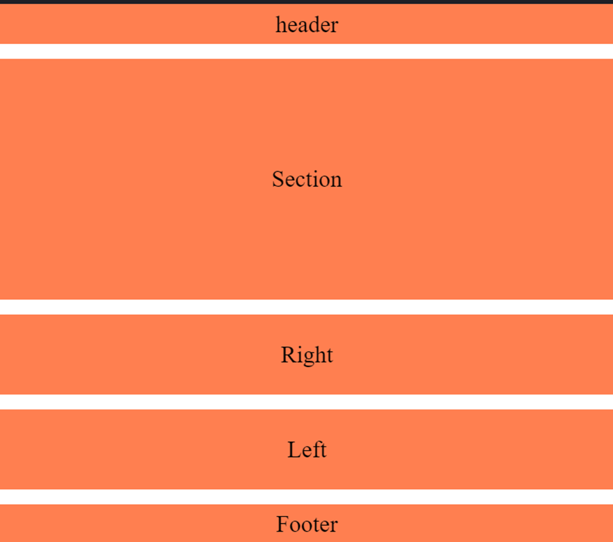
We have our mobile view setup as we wanted. Next we will create a media query breakpoint for the larger screen.
@media (min-width: 500px)  {
  .container {
    grid-template-areas:
      "header header  header"
      "left   section right"
      "footer footer  right";
    grid-template-rows: 1fr 6fr 1fr;
    grid-template-columns: 1fr 6fr 1fr;
  }
}
We created a break point and defined our grid-template-areas. As you can see from the example it is very intuitive and someone looking at the code will immediately be able to understand exactly what’s going on.
The `grid-template-rows` and `grid-template-columns` properties in the example is defining the fraction amount that a particular area sloth will fill up.
Our page at this point will look like below.
Grid template layoutYou can find the complete code for this section in the link below 👇
How to use the `minmax` function to dynamically track element size
Let’s say we have two columns and they are taking up the available spaces in the screen evenly. We can easily do this with `grid-template-columns`. However, what if we want one of our to be between 200px and 500px. Our columns will be responsive for various screen sizes but one of them will never be bigger than 500px and lesser than 200px.
For these types of scenarios we use the minmax function. Let’s see it in action.
<div class="container">
  <div class="one">One</div>
  <div class="two">Two</div>
</div>
.container {
  display: grid;
  height: 100vh;
  grid-template-columns: minmax(200px, 500px) minmax(100px, auto);
}
.one {
  background: cyan;
}
.two {
  background: pink;
}
In this example the first column will always be between 200px to 500px. Whereas, the second column can be minimum 100px and will cover the rest of the screen for larger screens.
You can find the complete example in the link below
How to use the repeat function with a grid template ?
Let’s talk about repeating patterns in elements. How do we deal with them? We can repeat our code or use javascript. However, there is another way to do it with css as well. The `repeat` function represents a repeated fragment of the track list, allowing a large number of columns or rows that exhibit a recurring pattern to be written in a more compact form.
<div id="container">
  <div>
    This item is 50 pixels wide.
  </div>
  <div>
    Item with flexible width.
  </div>
  <div>
    This item is 50 pixels wide.
  </div>
  <div>
    Item with flexible width.
  </div>
  <div>
    Inflexible item of 100 pixels width.
  </div>
</div>
#container {
  display: grid;
  grid-template-columns: repeat(2, 50px 1fr) 100px;
  grid-gap: 5px;
  box-sizing: border-box;
  height: 200px;
  width: 100%;
  background-color: #8cffa0;
  padding: 10px;
}

#container > div {
  background-color: #8ca0ff;
  padding: 5px;
}
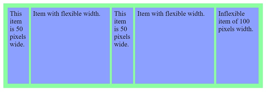
Find the code for this example here
Nested Grids
You can also nest grids within one another. Let’s take a look at how we can achieve this.
Here’s our html markup with nested grids
<div class="container">
  <div class="item">One</div>
  <div class="item">Two</div>
  <div class="item">Three</div>
  <div class="item inner-grid">
    <div class="item">i</div>
    <div class="item">ii</div>
    <div class="item">iii</div>
    <div class="item">iv</div>
    <div class="item">v</div>
    <div class="item">vi</div>
  </div>
  <div class="item">Five</div>
  <div class="item">Six</div>
</div>
We will first apply a grid to our outer container. Here’s how our code will look like.
.container {
  display: grid;
  height: 100vh;
  grid-gap: 10px;
  grid-template-columns: repeat(auto-fill, minmax(200px, auto))
}
Notice that we have a repeat function in our grid-template and we combined it with a minmax function. We can now apply grid properties to the inner grid as well.
.inner-grid {
  display: grid;
  background: white;
  height: 100%;
  grid-gap: 5px;
  grid-template-columns: repeat(3, auto);
}
That’s it now we have a grid inside another grid.
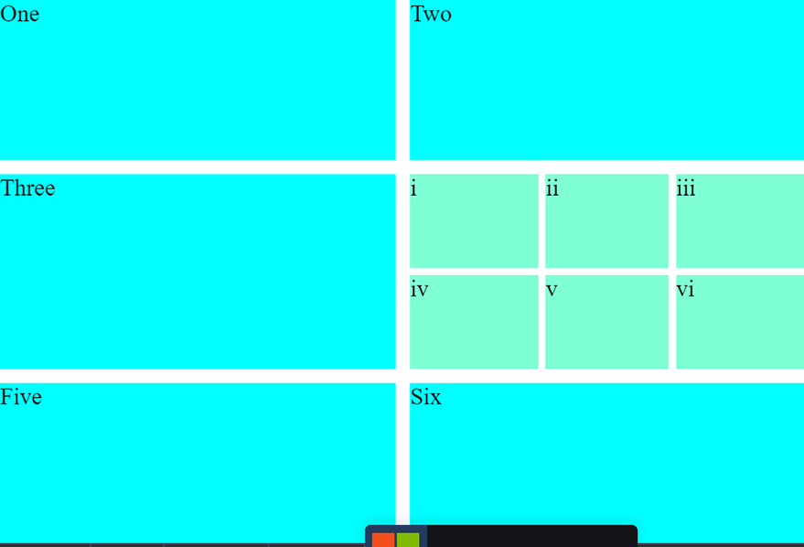
You can find the complete code for this section at the link below 👇
That’s all for today. I hope you enjoyed this article. For more front end tricks like this please subscribe to our newsletter. Until next time 🙂

