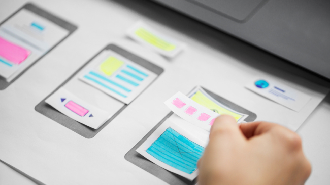

Web usability and usability testing are those few buzzwords you can’t afford to ignore. In this piece, we’ll review the basic principles of web usability, look at how users actually use the web and how you can benefit from that knowledge to make your websites and apps better.
What is web usability
Website usability defines how effectively users and visitors can use your website, including navigation bars, menus, content, images, videos, hyperlinks, forms, whatever else the users need to interact with in order for them to commit to purchasing your product, subscribe to your services, etc.
How people use the web
Before we hop on a train of defining the principles of web usability, let’s see how people actually use the web as opposed to how we think they might be using it.
Users don’t read your pages, sorry
No matter how hard you try to come up with your creative text, users will usually have 60 seconds on average to peruse it, that is — they probably won’t get to know you and read all of your verbiage, conversely — they scan and skim it trying to find the information they were looking for or words and phrases that would convince them to stay.
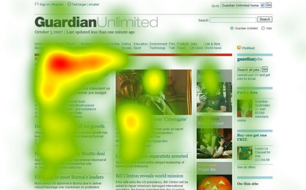
Video of eye-tracking:
Read the full report on the eye-tracking software here.
The reasons for not reading are plenty:
- Whenever users come to your landing page, they have a mission: they want to buy your product, find out your company’s location and working hours, the services you offer, etc. More often than not the users have limited time to find that information, and if they don’t find it quickly, they move to some other site (most probably your competitor’s) where they will eventually find what they were looking for.
- Users are smart and they know they don’t have to read all of your text. All they need is just a piece of information that’s hidden somewhere on your page (and it better be not).
- People, speaking especially of Gen Z, has been skimming the texts for ages: be it Reddit, Twitter, Facebook, The NYT digital edition, or anything else for that matter. The users have become accustomed to the prolificacy of written material and a never-diminishing abundance of information. They tend to disregard the majority of that said information unless it catches their attention or really interests them.
Users appreciate quality
Having said all of the above, content still plays one of the key roles on your site. If your website provides high-quality content that’s trustworthy and credible, users will still come to your site, even if the design is flawed or the site’s riddled with advertisements. Content takes prevalence over anything else. Ensure you have valuable content with well-written copy that would be helpful to your consumer and which would make them come back for more.
Users require instant gratification
If your website doesn’t boast of any quality content or is not designed or supposed to have a lot of written information, then it’s crucial to reduce the cognitive overload, which we’ll cover in greater detail in the next section, and make navigation, buttons, CTAs, and so on — self-evident and self-explanatory without forcing your user think. People are inherently impatient creatures and they want to find information as quickly as possible.
Users don’t make optimal choices
The users don’t look for an optimal solution, instead — they choose the first reasonable option. That might come as a shocker because designers tend to think that the user will consider all possible options before conceding to the most optimal solution. However, it’s quite the opposite — people choose the first reasonable option, not the best option. First off, the users tend to be in a hurry, there’s no penalty for guessing wrong, weighing options might not improve their chances of getting what they want but they lose time, besides finding out the answer and guessing are always fun.
Users want to have control
People don’t like to learn how new things work, instead — they muddle through them and if they find something that works, they stick to it. Having realized that, make people feel smart and more in control while using your site.
Guiding principles of web usability
According to the web usability guru, Steve Krug, whose book (Don’t Make Me Think) we’ve covered in our recent article, the [Ultimate Reading List for a Developer], ‘nothing important should be more than two clicks away’ (taken verbatim). Speaking of which, it all boils down to simplicity and making people think less than they should when making choices or coming with a viable decision on your site. To make it even more simplistic, whenever someone else looks at your page, everything needs to appear self-explanatory, obvious, and self-evident. For example, every button should look clickable and inviting. Every possible distraction on your site (that is when something is not self-evident) builds up a cognitive overload making the user either unhappy or totally unwilling to commit, moreover — it erodes the user’s confidence in your site and ultimately your company. Making things visible and self-evident also leads to fewer errors.
NB: The difference between self-explanatory and self-evident is that the former still takes a little time for the user to figure something out, not much time, but involves a little thought to understand.
So, let’s summarize all said above and describe the guiding principles of web usability below.
Be conventional
The easiest and yet the most effective things you could use are conventions. We’ve talked about conventions in more detail in our last article on [Web Accessibility]. TL;DR: basically, it boils down to the effective use of the standardized design patterns, meaning the users would expect certain things to look/act/read in a conventional way.
These patterns include:
- Logo placed in the top-left corner of the site (left-to-right reading countries)
- Navigation across the top or down the left side
- Using conventional names, for example, a shopping cart for, well, a shopping cart, Vacancies or Jobs instead of more creative solutions like “Jobify Yourself Here,” etc.
- Video play button (a circle with a triangle in it)
- Scrollbars
- Link styling (should be clearly visible and preferably, but not necessarily, underlined)
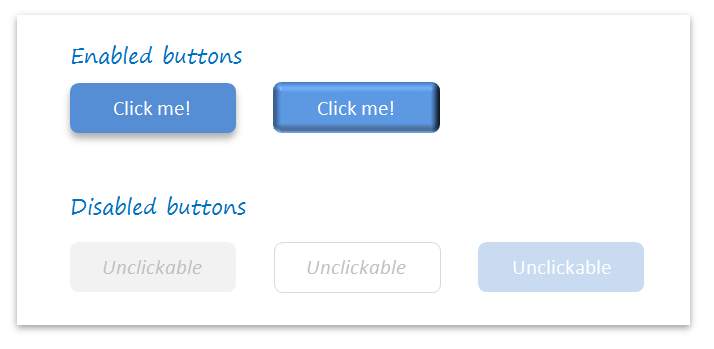
- Buttons should appear visible and clickable and lead to something else (otherwise they should be removed or appear deactivated)
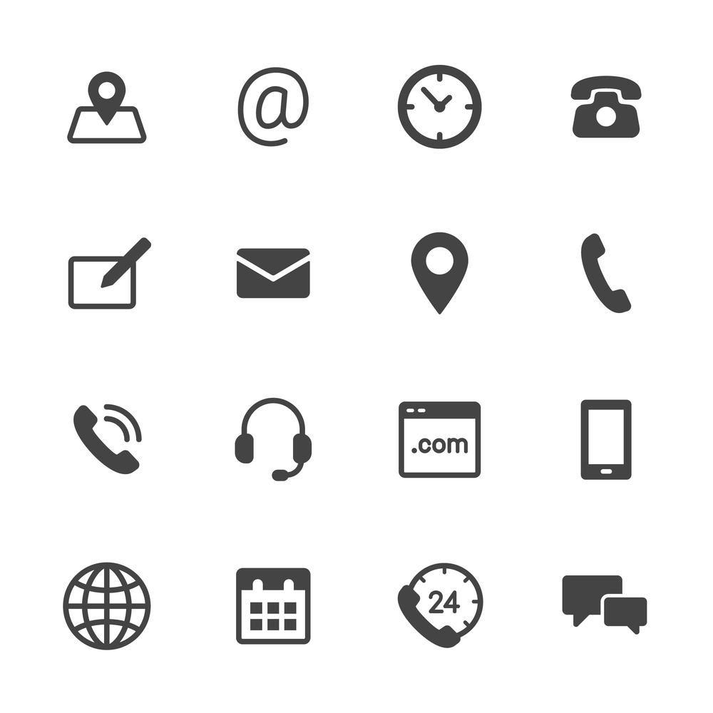
- Icons: an envelope for email, a shopping cart for a shopping cart, social media icons for social media sharing, etc.
The main rule of thumb here is not to replace the convention or replace it only if it’s self-evident, self-explanatory, requires zero or min learning curve, and adds super value that it makes a little learning curve substantiated.
Create a clear visual hierarchy
The visual hierarchy should prominently highlight which things are most important, which are similar, and which things are part of other things. Steve Krug in his book on Usability shares a few important tips that will help you make your visual hierarchy more appealing and clear:
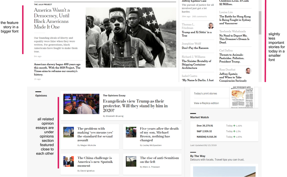
- The most important things should be prominent: make them larger, bolder, distinct in color, surrounded by white space or placed somewhere near the top of the page;
- Things that are similar or related logically should appear visually related: grouped, placed under the same heading, displayed in the same style, and put in a clearly defined area;
- Nested things should clearly show what belongs to what or what is part of another: the books should be placed in categories and then subcategories, for example, Computer Science — JavaScript — ES6
Don’t make users think
‘Don’t make users think’ is the exact thesis of the eponymous book by Steve Krug. Krug’s main assumption is that users hate thinking, they have neither the resources nor intentions to figure out stuff on your site. That’s why it’s vital to make things easy, simple, self-explanatory, and self-obvious. Your job as a web designer or a usability tester is to find out as many question marks as possible and try to eliminate those by incorporating other described here-in strategies and user responses.
Question marks to look out for include (but not limited to):
Clickable things should appear clickable.
Whenever users scan the page, they look for visual cues that identify things as either clickable or tappable, things associated with buttons, tabs, menu bars, colors, and underlining. Users constantly parse the web environment to decide where to click next and where to go further down the list looking for more information.
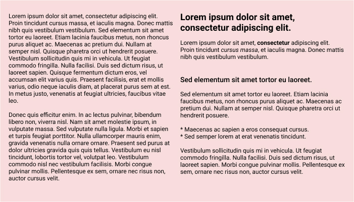
Readable things should appear readable.
Make plenty of headings (something which we’ve already discussed in our previous article on [Web Accessibility]), incorporate a table of contents, make bullet points, keep paragraphs short (something I personally truly suffer from), highlight key terms, use bold and italics sparingly.
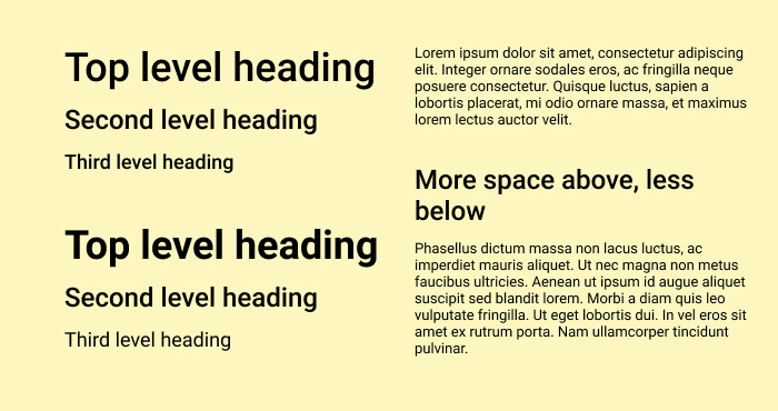
Something which has already been reiterated by many, yet still needs to be mentioned: make sure you have only one h1 per page, then a couple of h2, and further subheading h3, h4, etc.
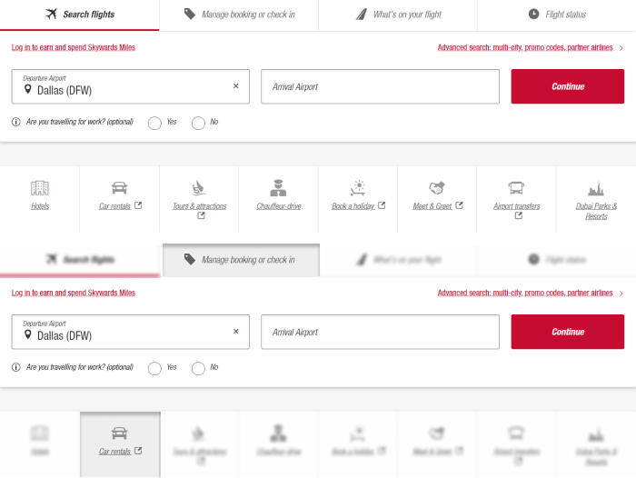
While making a heading, make sure it doesn’t float or stay in limbo on the page but stays as close to the section it describes. See the example below.
It’s recommended to put additional space between bullet points, although sometimes it’s not easily rendered when you’re using a default CMS, or another software where some style came predefined unless you’re smart enough to change the defaults, which I’m sure you’re.
Arriving at a decision should be easy
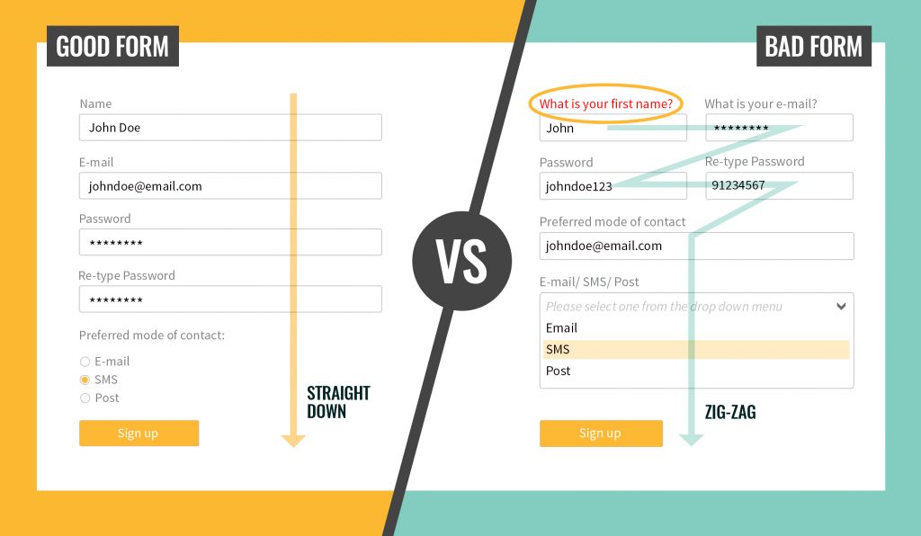
Whenever the user’s surrounded by too many choices, their mental game slows down most often resulting in them feeling confused, unhappy, even stupid. Especially, decision making relates to users filling out the forms. These are a few tips on how to make it easier for your potential customers to make their way around the completion of any forms on your site:
- Ensure there’s a brief that will help users to understand the form;
- The form is placed in a timely fashion and users encounter it ONLY if they need it;
- Forms should be formatted as unavoidable to make sure users will notice them when the right time comes.
The rule of thumb: do not ask for registration or subscriptions first, remove all barriers that can come in the way of your incoming traffic.
Hire a better copywriter
The Elements of Style (which I am not exactly a fan of if you have not yet noticed), so praised and worshipped by many, call for simplicity, which can be achieved with
- Omitting the needless words: using short and concise phrases, plain and objective language
- Deleting all the useless ‘happy talk’ (welcoming stuff saying how great you are instead of showing exactly what makes you great) and avoiding the promotional copy. Instead of the long useless passages of happy text, write a so-called ‘welcome blurb,’ a terse description of the site, displayed in a prominent block on the Home page, at the top left or center of the content space. Come up with a catchy tagline that would describe your whole enterprise and make it memorable, make you different and convey the benefits for the users.
- Eliminating instructions and making everything self-explanatory
- Including relevant images
- Marking keywords in bold and italics (but sparingly and not overusing it)
- Talking business: avoiding cute, clever, or technical names. Instead of ‘Explore our services now’ use simple ‘Sign up’
Expose the main features
Guiding users is never a bad idea because it works: guidelines lead the visitors through the site content in a very simple way that’s both understandable and effective.
Show the user exactly what functions and services are available and guide them through those services as smoothly as possible.
Be simple
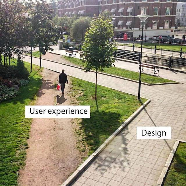
Designers often think that the users will come back to the site because of their design. However, in reality — the visitors come to the site despite the design and for the information. That’s exactly why you need to strive for simplicity. According to Krug’s the Big Bang Theory of Web: the first few seconds users spend on the page are critical. The questions visitors ask while scanning your page for the first time are: what’s this, what can I do here, what do they have here, and why should I even be here. That’s why — spill out all the important info on the first page and surround it by a very simple and understandable design.
White space is nothing to be afraid of
White space is actually extremely helpful in a couple of ways: first, it reduces the cognitive overload, secondly, it gives more time for the users to perceive the information they have just read or skimmed through. Complex structures and loads of text are usually always difficult to comprehend, that’s exactly why hierarchical structures remove the said complexity.
Test early and often
Before we define usability testing, here’s a short funny animation video Krug made to get his point across:
Now for the definition and the difference between usability testing and focus groups.
According to Wikipedia, the mother of all knowledge, ‘usability testing is a technique to evaluate a user-centered interaction design by testing it on users.’ The difference between usability testing and focus groups lies in the completely opposite approaches to finding out more about the users and how they use your product: focus groups make 5-10 people talk about using your product, whereas usability tests make one person at a time actually use your product. Using instead of talking about using your product makes a very big difference in the anticipated results.
Some important things to keep in mind:
- Testing one user is always better than testing no users, and testing one user early on in the process of developing your product is better than testing fifty people at completion of that same project
- Testing should be iterative: design -test -fix -design -test -fix
- Testing should be never made by the people who worked on the project
Here’s the video I particularly found useful in understanding usability testing:
If you don’t have an opportunity to watch the whole video, here’s the gist of it.
The simplest way to start is to do a guerrilla-style test: find a person at a bar or a cafe, buy them a drink (any incentive would work), try to get to know them a little, and then ask to actually use your product.
Go over their initial impressions with questions like ‘what do you think this does’ or ‘what’s going on here.’ For websites, a blink test works: show the user your site for 5 seconds, pull your laptop away, and ask what they think your website does.
For both mobile apps and websites, perform an expectancy test: probe the user on what they expect from certain or all icons, buttons, links, etc.
Ask your users to do a certain task or perform a distinct scenario to find out how they will behave on your site. Start with simpler tasks before moving on to more complex ones.
While being at it — record the video of the test for future reference. You can use OBS for screen capture, QuickTime, Handbrake for conversion, etc.
You can add any sort of formality to the guerrilla-style test and perform it in your company’s usability labs. However, no matter where you actually happen to be or perform the test, ensure you make people comfortable.
You can certainly read more about Usability Testing in Steve Krug’s Rocket Surgery Made Easy: The Do-It-Yourself Guide to Finding and Fixing Usability Problems. We’ll definitely cover that one in our future articles.
Another video that might be of some help in understanding the process:
Conclusion
We’ve tried to cover as much as we could in the above piece and if you have any questions or, otherwise, interesting stories about web usability and testing, we’d be super glad to learn from you!
And before we let you go, here’s some food for thought:
“Users of the Web, unite at the useful sites: you have nothing to lose […]” Jakob Nielsen, Designing Web Usability, 1999
p. 390 pic.twitter.com/oIhovs6XeR— olia lialina (@GIFmodel) September 6, 2017