Collecting data from users is an important feature in web applications. The best approach is to make use of forms, which involves the user entering their information which will be stored in a database and used to serve their needs. Since humans are prone to error, it is important to ensure that the data collected is correct. As such forms have to be validated. There are lots of libraries out there that can be used to validate forms. When choosing a library, it is needful that you are away of what the library is offering.
In this tutorial, we will be looking at a light-weight validation library, called Vuelidate. Vuelidate makes validation in forms built with Vue.js seamless. If offers the following features.
- The validation is decoupled from the form – with this you are sure of a clean form – a form that\’s not messed up with rules.
- There’s the possibility of you having custom validators that can be used to validate unique fields or data.
- It comes with a bunch of reusable validators – as such, you won\’t need to write a lot of validators, the ones it ships with can be used for most of your basic needs.
The sample code for this tutorial is available on CodeSandbox. You can also follow along on your local machine, first, you need to bootstrap your application.
Integrating Vuelidate
npx vue create vuelidate-form
This will bootstrap a Vue application in the folder – vuelidate-form
Next, let’s add the Vuelidate package, if you prefer yarn, you can use;
yarn add vuelidate
For npm, use;
npm add vuelidate
We have to import the package into our main.js file
import Vue from "vue";
import App from "./App.vue";
import Vuelidate from "vuelidate";

Vue.config.productionTip = false;
Vue.use(Vuelidate);

new Vue({
  render: h => h(App)
}).$mount("#app");
We will be making use of TailwindCSS to make the form look beautiful, open your index.html file and drop this in the head part of the file
<link href="https://unpkg.com/tailwindcss@^1.0/dist/tailwind.min.css" rel="stylesheet">
For this example, we will be building a registration form. We want to collect the full name, email address, password, and phone number of potential users. Without any validation plugged in, here is how the code for the form should look like
<template>
  <div id="app">
    <form>
      <div class="bg-white shadow-md rounded px-8 pt-6 pb-8 mb-4 flex flex-col my-2">
        <div class="md:w-1/2 px-3 mb-6 md:mb-0">
          <label
            class="block uppercase tracking-wide text-grey-darker text-xs font-bold mb-2"
            for="grid-full-name"
          >Full Name*</label>
          <input
            class="appearance-none block w-full bg-grey-lighter text-grey-darker border border-red rounded py-3 px-4 mb-3\"
            id="grid-full-name"
            type="text"
            placeholder="Jane Doe"
          >
        </div>
        <div class="md:w-1/2 px-3 mb-6 md:mb-0">
          <label
            class="block uppercase tracking-wide text-grey-darker text-xs font-bold mb-2"
            for="grid-email"
          >Email Address*</label>
          <input
            class="appearance-none block w-full bg-grey-lighter text-grey-darker border border-red rounded py-3 px-4 mb-3\"
            id="grid-email"
            type="text"
            placeholder="janedoe@gmail.com"
          >
        </div>
        <div class="md:w-1/2 px-3 mb-6 md:mb-0">
          <label
            class="block uppercase tracking-wide text-grey-darker text-xs font-bold mb-2"
            for="grid-password"
          >Password*</label>
          <input
            class="appearance-none block w-full bg-grey-lighter text-grey-darker border border-red rounded py-3 px-4 mb-3\"
            id="grid-password"
            type="password"
            placeholder="********"
          >
        </div>
        <div class="md:w-1/2 px-3 mb-6 md:mb-0">
          <label
            class="block uppercase tracking-wide text-grey-darker text-xs font-bold mb-2"
            for="grid-password-confirmation"
          >Password Confirmation*</label>
          <input
            class="appearance-none block w-full bg-grey-lighter text-grey-darker border border-red rounded py-3 px-4 mb-3\"
            id="grid-password-confirmation"
            type="password"
            placeholder="********"
          >
        </div>
        <div class="md:w-1/2 px-3 mb-6 md:mb-0">
          <label
            class="block uppercase tracking-wide text-grey-darker text-xs font-bold mb-2"
            for="grid-phone"
          >Phone Number*</label>
          <input
            class="appearance-none block w-full bg-grey-lighter text-grey-darker border border-red rounded py-3 px-4 mb-3\"
            id="grid-phone"
            type="text"
            placeholder="+2348122112211"
          >
        </div>
        <div class="-mx-3 md:flex mt-2">
          <div class="md:w-full px-3">
            <button
              class="md:w-full bg-gray-900 text-white font-bold py-2 px-4 border-b-4 hover:border-b-2 hover:border-t-2 border-gray-500 hover:border-gray-100 rounded\"
            >Submit</button>
          </div>
        </div>
      </div>
    </form>
  </div>
</template>
To make use of Vuelidate, we have to import the libraries that will be used for validation
import { required, minLength, email, sameAs } from "vuelidate/lib/validators";
Let’s step back and think about the process of validation and how we will make use of these validators. We want to ensure the following;
- The data entered by the users are not less than a certain length. This is where minLength will come in handy.
- For this form, we need all the data, that means all fields are required.
- Since we have a password and password confirmation field, both of these need match.
The data for our component will contain the information we want to collect, and we also need to find out if there are errors or not.
data() {
    return {
      user: {
        full_name: "",
        email: "",
        phone: "",
        password: "",
        passwordConfirmation: ""
      },
      errors: false
    };
  },
We will build our validation below what we have above. As we stated when thinking about the validation, here is how that will look like;
validations: {
    user: {
      full_name: {
        required,
        minLength: minLength(2)
      },
      email: {
        required,
        email
      },
      password: {
        required,
        minLength: minLength(8)
      },
      passwordConfirmation: {
        required,
        sameAsPassword: sameAs("password")
      },
      phone: {
        required
      }
    }
  },
Since we are validating the data that will be stored in the user object, the validation has to refer to it. In it, we reference our form field and validate those using the validators we imported. There are tons of validators that you can make use of, you can find them on the documentation.
Next, let us add the method that will be called when the form is clicked.
methods: {
    handleSubmit() {
      this.$v.user.$touch();
      this.empty = !this.$v.user.$anyDirty;
      this.errors = this.$v.user.$anyError;

      if (this.errors === false && this.empty === false) {
        JSON.stringify(this.user);
      } else {
        console.log("errors");
      }
    }
  }
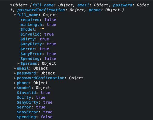
this.$v contains the validation state of the form. In this case, when the button is clicked, it is built using the validation structure we built earlier.

With this structure, we can determine if there are errors on the form. If you take a look at the image about you’ll see that we have different ways of tracking the state of the form. We can use this to determine if the form should be submitted or not. As seen in the submit method we make use of $anyDirty and $anyError to handle this. $anyDirty helps us to find out if the form has been touched by the user at least once and it returns a boolean value. $anyError as the name implies helps us figure out if the form has an error. You can learn more about these values and others on the documentation.
Displaying Errors to Users
When the form has been touched and there are no errors, the form will be submitted, else, the errors will be logged to the console as seen in the example. To deliver a good user experience, it will be great to display the errors of each form. We can do that using the values gotten from $v.user .
As you can see in the snapshot above, we have a full_name object. Using the validation object we created before we can handle the display of errors on the input field like this.
<div class="md:w-1/2 px-3 mb-6 md:mb-0">
  <label
    class="block uppercase tracking-wide text-grey-darker text-xs font-bold mb-2"
    for="grid-full-name"
  >Full Name*</label>
  <input
    class="appearance-none block w-full bg-grey-lighter text-grey-darker border border-red rounded py-3 px-4 mb-3"
    id="grid-full-name"
    type="text"
    placeholder="Jane Doe"
    v-model.trim="$v.user.full_name.$model"
  >
  <p class="text-red-500 text-xs italic" v-if="errors">
    <span v-if="!$v.user.full_name.required">Please fill out this field.</span>
  </p>
</div>
We make use of v-model to handle the value that the user will enter. Since the validation we have for full_name is required , we conditionally display the error message if one is encountered. We’ll need to do the same thing for other fields, so the template needs to be updated to look like this.
<template>
  <div id="app">
    <form @submit.prevent="handleSubmit">
      <div class="bg-white shadow-md rounded px-8 pt-6 pb-8 mb-4 flex flex-col my-2">
        <div class="md:w-1/2 px-3 mb-6 md:mb-0">
          <label
            class="block uppercase tracking-wide text-grey-darker text-xs font-bold mb-2"
            for="grid-full-name"
          >Full Name*</label>
          <input
            class="appearance-none block w-full bg-grey-lighter text-grey-darker border border-red rounded py-3 px-4 mb-3\"
            id="grid-full-name"
            type="text"
            placeholder="Jane Doe"
            v-model.trim="$v.user.full_name.$model"
          >
          <p class="text-red-500 text-xs italic" v-if="errors">
            <span v-if="!$v.user.full_name.required">Please fill out this field.</span>
          </p>
        </div>
        <div class="md:w-1/2 px-3 mb-6 md:mb-0">
          <label
            class="block uppercase tracking-wide text-grey-darker text-xs font-bold mb-2"
            for="grid-email"
          >Email Address*</label>
          <input
            class="appearance-none block w-full bg-grey-lighter text-grey-darker border border-red rounded py-3 px-4 mb-3\"
            id="grid-email"
            type="text"
            placeholder="janedoe@gmail.com"
            v-model.trim="$v.user.email.$model"
          >
          <p class="text-red-500 text-xs italic" v-if="errors">
            <span v-if="!$v.user.email.required">Please fill out this field.</span>
            <span v-if="!$v.user.email.email">This is not a valid email address.</span>
          </p>
        </div>
        <div class="md:w-1/2 px-3 mb-6 md:mb-0">
          <label
            class="block uppercase tracking-wide text-grey-darker text-xs font-bold mb-2"
            for="grid-password"
          >Password*</label>
          <input
            class="appearance-none block w-full bg-grey-lighter text-grey-darker border border-red rounded py-3 px-4 mb-3\"
            id="grid-password"
            type="password"
            placeholder="********"
            v-model.trim="$v.user.password.$model"
          >
          <p class="text-red-500 text-xs italic" v-if="errors">
            <span v-if="!$v.user.password.required">Please fill out this field.</span>
          </p>
        </div>
        <div class="md:w-1/2 px-3 mb-6 md:mb-0">
          <label
            class="block uppercase tracking-wide text-grey-darker text-xs font-bold mb-2"
            for="grid-password-confirmation"
          >Password Confirmation*</label>
          <input
            class="appearance-none block w-full bg-grey-lighter text-grey-darker border border-red rounded py-3 px-4 mb-3\"
            id="grid-password-confirmation"
            type="password"
            placeholder="********"
            v-model.trim="$v.user.passwordConfirmation.$model"
          >
          <p class="text-red-500 text-xs italic" v-if="errors">
            <span v-if="!$v.user.passwordConfirmation.required">Please fill out this field.</span>
            <span v-if="!$v.user.passwordConfirmation.sameAsPassword">Please the passwords need to match.</span>
          </p>
        </div>
        <div class="md:w-1/2 px-3 mb-6 md:mb-0">
          <label
            class="block uppercase tracking-wide text-grey-darker text-xs font-bold mb-2"
            for="grid-phone"
          >Phone Number*</label>
          <input
            class="appearance-none block w-full bg-grey-lighter text-grey-darker border border-red rounded py-3 px-4 mb-3\"
            id="grid-phone"
            type="text"
            placeholder="+2348122112211"
            v-model.trim="$v.user.phone.$model"
          >
          <p class="text-red-500 text-xs italic" v-if="errors">
            <span v-if="!$v.user.phone.required">Please fill out this field.</span>
          </p>
        </div>
        <div class="-mx-3 md:flex mt-2">
          <div class="md:w-full px-3">
            <button
              class="md:w-full bg-gray-900 text-white font-bold py-2 px-4 border-b-4 hover:border-b-2 hover:border-t-2 border-gray-500 hover:border-gray-100 rounded\"
            >Submit</button>
          </div>
        </div>
      </div>
    </form>
  </div>
</template>
Custom Validator
What happens in cases where you have a field that requires a kind of validation that Vuelidate does not provide? If you\’re thinking about that, I have good news – Vuelidate has you covered on that end. When you think about Vuelidate validators, you should know that under the hood, they\’re functions – they take the values of the field they\’re applied to and spit out boolean values – true or false, depending on the result of the validation. To see how that works, we will rewrite the validation for the password and make use of regex to test the strength. We will call the function isPasswordStrong, and it will accept the value of the password.
That will make the validation for the password to look like this,
password: {
  required,
  isPasswordStrong(password) {
    const regex = /^[#\\w@_-]{8,20}$/;
    return regex.test(password);
  }
},
This new function gives us a way to display the error on the template, similar to what we did for the required validation. The input field for the password will look like this.
<div class="md:w-1/2 px-3 mb-6 md:mb-0">
  <label
    class="block uppercase tracking-wide text-grey-darker text-xs font-bold mb-2"
    for="grid-password"
  >Password*</label>
  <input
    class="appearance-none block w-full bg-grey-lighter text-grey-darker border border-red rounded py-3 px-4 mb-3"
    id="grid-password"
    type="password"
    placeholder="********"
    v-model.trim="$v.user.password.$model"
  >
  <p class="text-red-500 text-xs italic" v-if="errors">
    <span v-if="!$v.user.password.required">Please fill out this field.</span>
    <span
      v-if="!$v.user.password.isPasswordStrong"
    >Please the chosen password isn't strong enough.</span>
  </p>
</div>
We can go further to extract the custom validator into a separate file so that our component looks neat – if you’ll be having more than one custom validator, this looks like a good approach to follow. So you can create a file called validator.js
const regex = /^[#\\w@_-]{8,20}$/;

export default function isPasswordStrong(value) {
  return regex.test(value);
}
Now we only need to import isPasswordStrong in our component and use it in the password validation object like we did with the in-built validators.
import isPasswordStrong from "./validator";

...

password: {
  required,
  isPasswordStrong
},
Conclusion
There are other benefits to using Vuelidate, your best coach going forward is to make use of the documentation are you integrate it into your form. You have seen how it works; the creating of validation rules, how to check the errors encountered, and how to display the error to the users. You can take it a step forward by implementing custom validators.


