Defenition: POS – “Point of Sale”. At the point of sale, the merchant calculates the amount owed by the customer, indicates that amount, may prepare an invoice for the customer (which may be a cash register printout), and indicates the options for the customer to make payment.
In the previous chapter, we discovered how to make relations on the database and deal with new UI change by adding multiple dropdowns. We upgraded the CRUD operations to the next level with the addition of Relationships in backend API configurations.
In this chapter, we are going to learn something new and tackle another challenge. We are going to upgrade the boring old general table feature to a rich full-fledged table with features like filtering, sorting, pagination, grouping, etc. Meanwhile, in this chapter, we are going to deal with integrating react-table to the old table first.
react-table is one of the popular and dynamic table components for React. In the latest version, we are going to discard the old codebase and transform it into the headless component.
Here, we are going to create a new branch component in order to try and experiment before applying to another component.
let’s get started!
Setting up react-table package
First, we need to install the react-table package into our project. For this, we need to run the following command in our project terminal:
yarn add react-table
Then, we need to create a separate component called Table.js in our ./components directory using the following command in the terminal:
mkdir components/Table.js
Next, we need to import the necessary components as shown in the code snippet below:
import React from "react";
import { useTable } from "react-table";
Create a new React Table Component
Here, we are going to create a functional component named Table in order to handle the new React Table instance taking columns and data as props. The code to implement it is provided in the code snippet below:
export default function Table({ columns, data }) {
    const {
        getTableProps,
        getTableBodyProps,
        headerGroups,
        rows,
        prepareRow,
    } = useTable(
        {
            columns,
            data
        }
    );
Next, we need to create a table markup and attach the react-table method to the control table code below. This will help us understand the concept of the headless components. Instead, we generate all HTML from <Table …otherProp />. Then, we attach the component method as inline properties as directed in the code snippet below:
return (
        <table {...getTableProps()} className="table table-bordered table-condensed table-responsive" style={{ 'display': 'table' }} >
            <thead>
                {headerGroups.map(headerGroup => (
                    <tr {...headerGroup.getHeaderGroupProps()}>
                        {headerGroup.headers.map(column => (
                            <th >
                                {column.render("Header")}
                            </th>
                        ))}
                    </tr>
                ))}
            </thead>
            <tbody {...getTableBodyProps()}>
                {rows.map((row, i) => {
                    prepareRow(row);
                    return (
                        <tr {...row.getRowProps()}>
                            {row.cells.map(cell => {
                                return (
                                    <td {...cell.getCellProps()}>{cell.render("Cell")}</td>
                                );
                            })}
                        </tr>
                    );
                })}
            </tbody>
        </table>
    );
Now, we have successfully implemented our Table component.
Using Table component
Here, we need to import the Table component and its CSS for adjusting table along with loading image to ../branch/index.js file as directed in the code snippet below:
import Table from '../Table';
import './branch.css'
import loading from '../../assets/image/loading.gif'
Next, we are going to create a React memo constant called columns using useMemo hook to handle column structure. The table layout structure in the code below shows our migration from the old table. It is nothing new.
We can replicate this step on another component as well.
const columns = React.useMemo(
        () => [
            {
                Header: "Front Image",
                accessor: "frontimage",
                Cell: ({ cell: { value } }) => <img class="img-fluid img-rounded"
                    width={200} src={process.env.REACT_APP_BRANCH_FRONT_IMAGE_PATH + '/' + value} />
            },
            {
                Header: 'Name',
                accessor: 'name', // accessor is the "key" in the data
            },
            {
                Header: 'Address',
                accessor: 'address',
            },
            {
                Header: 'Pos Machine',
                accessor: 'pos_machines',
                Cell: ({ cell: { value } }) => {
                    return value.map(data => {
                        return <span key={data} className="badge">{data.alias}</span>
                    })
                }
            },
            {
                Header: 'Action',
                accessor: '_id',
                Cell: ({ cell: { value } }) => {
                    // alert(id)
                    return <><Link to={"/branch/update/" + value} type="button"
                        class="btn btn-primary" style={{ 'margin-right': '5px' }}
                        onClick={() => dispatch(branchActions.clearState())}
                    >
                        Edit
                        </Link>
                        <Link type="button" class="btn btn-danger" onClick={() => confirmDelete(value)}>
                            Delete
                    </Link></>
                }
            },
        ],
        []
    )
Here, we need to wait for data from the server once again to be available on reducer before we render the table.
Next, we need to create a function to handle conditional rendering while we display loading image until waiting for the data to load. The code for the function is provided in the code snippet below:
const Holdon = (columns) => {
        if (branchReducer.result) {
            return <Table columns={columns} data={branchReducer.result} />
        } else {
            return <img class="img-fluid img-rounded"
                src={loading} />
        }
    }
Lastly, we need to call the Holdon function to the render function in order to display it to the interface as shown in the code snippet below:
<div className="card card-body">
          {Holdon(columns, data)}
</div>
Hence, we will get the result as displayed in the simulation below:
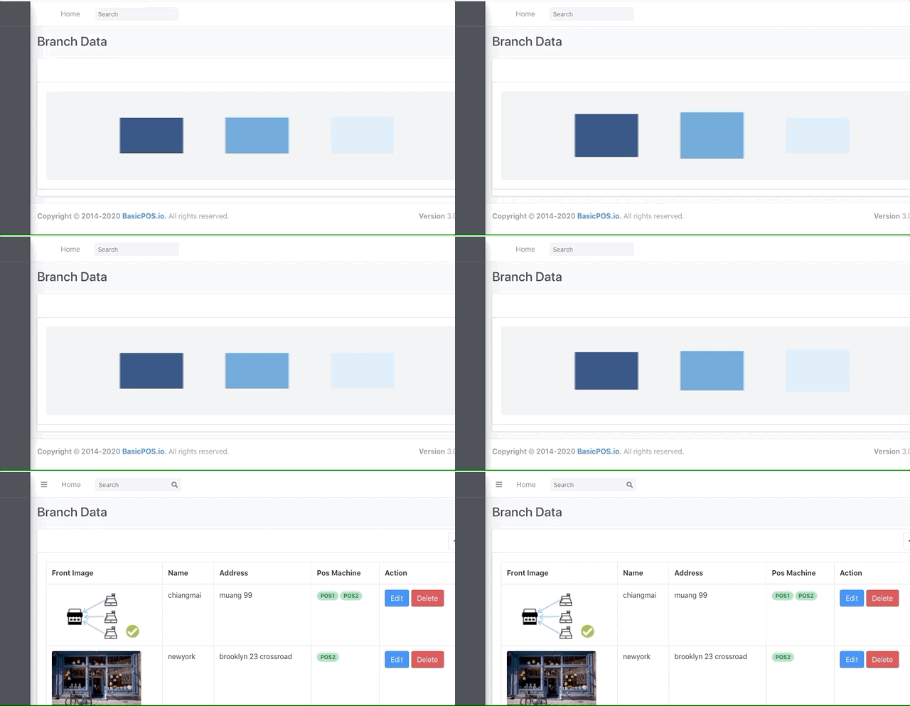
Finally, we have successfully created and integrated the Table component using the react-table component.
Filtering
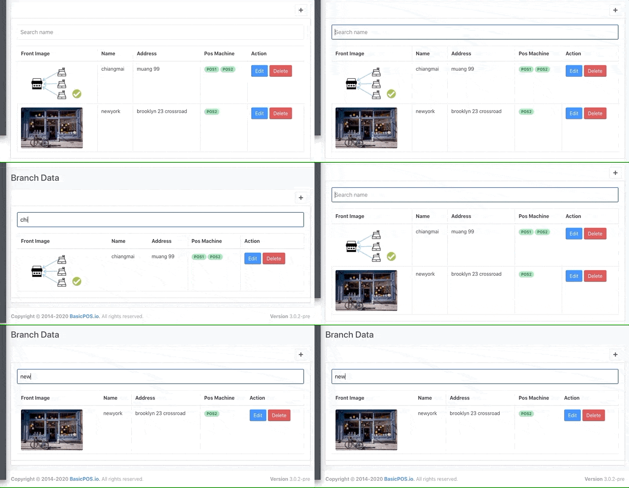
Here, we are going to work on Table.js file only. The idea of filtering is filtering through the database based on the input data that we add to the input field in the table header. Thus, the table will only show the filtered data at the end.
First, we need to import useFilters hook from react-table as shown in the code snippet below:
import { useTable, useFilters } from "react-table";
Then, we need to create a new state called filterInput to hold the filter input data as directed in the code snippet below:
const [filterInput, setFilterInput] = useState("");
Next, we need to attach useFiltershook and setFilterInput state function to react-table object as shown in the code snippet below:
const {
        getTableProps,
        getTableBodyProps,
        headerGroups,
        rows,
        prepareRow,
        setFilter
    } = useTable(

        {
            columns,
            data
        }, useFilters,
    );
Now, we need to create a function to handle the filtering tasks. For initial setup, we are going to use the name column in order to filter through the data as shown in the code snippet below:
const handleFilterChange = e => {
        const value = e.target.value || undefined;
        setFilter("name", value);
        setFilterInput(value);
    };
Lastly, we need to add a new input field at the top of the table using the input element with required props and functions as highlighted in the code snippet below:
<>
            <input
                value={filterInput}
                onChange={handleFilterChange}
                placeholder={"Search name"}
            />
            <table {...getTableProps()} className="table table-bordered table-condensed table-responsive" style={{ 'display': 'table' }} >
                <thead>
                    {headerGroups.map(headerGroup => (
                        <tr {...headerGroup.getHeaderGroupProps()}>
                            {headerGroup.headers.map(column => (
                                <th >
                                    {column.render("Header")}
                                </th>
                            ))}
                        </tr>
                    ))}
                </thead>
Hence, we will get the result as displayed in the following demo.
Challenge…
Now, the challenge is to implement it to our other components.
Conclusion
In this chapter, we learned how to integrate react-table to our codebase and replace the old table. We created a headless Table component so that we can import it to other components and use it easily. The difficult part was to handle the data from the server in order to display it in the table view. Here, we have to wait for data to load completely from the server otherwise an error may occur. For this, we implemented the hold-on function which dealt with it easily.
In the next chapter, we will learn how to add sorting and grouping features to our Table component.
The code for this chapter is available on Github.
See you at the next one! Adios!


