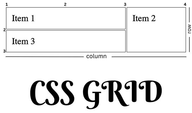
For those just starting out with CSS, the process of creating responsive websites might seem insurmountable, but help is at hand in the form of CSS Grid. Learn how CSS Grid can change the way you build websites by following along as I walk you through a comprehensive guide.
What is CSS Grid
Cascading Style Sheets Grid Layout, or CSS Grid for short, is a fantastic layout framework made especially for creating flat web designs. It’s a revolutionary step forward in the world of CSS, providing a flexible and user-friendly method for arranging elements on a web page in rows and columns with infinite customization options. CSS Grid allows web designers to easily create complex, responsive designs, as opposed to traditional layout approaches like floats or tables. It simplifies the task of organizing material and creates a solid foundation for creating appealing, user-friendly websites. In a word, CSS Grid is the most powerful tool for creating cutting-edge website designs, allowing developers to fully realize their dreams on the screen.
Why use CSS Grid?
There are several compelling arguments for web designers and developers to adopt CSS Grid as a potentially game-changing layout solution. The following are just a few of the many reasons why CSS Grid is an essential part of contemporary web design:
- It gives you complete control over your layout in two dimensions, which is why I prefer CSS Grid over alternative layout solutions like Flexbox. Its adaptability allows designers to easily create elaborate designs.
- It’s easy to create designs that look great on every screen size thanks to CSS Grid. Grid’s media queries and grid template regions make it easy to rearrange and resize content for various screen sizes. This guarantees a consistent user experience across all gadgets.
- Prior to the introduction of CSS Grid, designers often used workarounds and hacks like as floats or tables to accomplish their layout goals. CSS Grid does away with the necessity for them, resulting in simpler, more easily understood, and more easily modified code.
- With CSS Grid, you can easily align and distribute items inside the grid thanks to its robust alignment and spacing capabilities. These options provide designers granular control over the visual style of their layouts, allowing them to create highly refined and expert-looking final products. Because I place a premium on accuracy.
- More design leeway is available because to CSS Grid’s adaptability and fine-grained control. There is no limit to what may be produced using CSS Grid, from complex magazine-style layouts to adaptable picture galleries.
Basic Concepts in CSS Grid
When working with the CSS grid, there are two basic concepts you must be familiar with in order to effectively use it, and they are:
1. Grid Container
2. Grid Item
While working with CSS Grid, the Grid Container is the foundation upon which your grid components are arranged. Designating an element as a Grid Container grants access to powerful grid properties, simplifying the creation of complicated, adaptable layouts.
Just assigning the display: grid;|property to the required element in your CSS will transform it into a Grid Container.
When you’ve built the framework, you can define the structure of your grid by specifying the number of rows and columns and the sizes of each. The grid-template-rows and grid-template-columns properties are some you use to do this.
To demonstrate, let’s look at a basic scenario.
<!DOCTYPE html>
<html>
  <head>
    <title>CSS Grid Example</title>
    <style>
      .container {
        display: grid;
        grid-template-columns: repeat(3, 1fr);
        grid-template-rows: repeat(2, 150px);
        grid-gap: 10px;
      }

      .item {
        background-color: #ddd;
        padding: 20px;
        font-size: 40px;
        text-align: center;
      }
    </style>
  </head>
  <body>
    <div class="container">
      <div class="item">1</div>
      <div class="item">2</div>
      <div class="item">3</div>
      <div class="item">4</div>
      <div class="item">5</div>
      <div class="item">6</div>
    </div>
  </body>
</html>
In this example, the Grid Container have two rows with heights of 150px each, and three columns with widths defined as fractions (1fr) which implies equal width for all items.
And this is what the end result looks like.

Grid Template Rows and Columns
These are the building blocks of your design, and you may adjust their size and placement to meet your specific requirements.
While creating a layout, I’ve found that working with rows and columns from a grid template gives me the most freedom. Using a combination of length, percentage, and other values, you may specify and adjust your grid item within the grid container. If you want your row to have a height of 100px, for instance, you would use the value 100px. Another option is to use a keyword value such as auto, which causes the row’s height to adapt dynamically to its contents.
The fr unit, which stands for a percentage of the grid container’s total accessible space, is another handy addition. Setting the height of a row to 1fr signifies that the row will take up one unit of space, with the remaining space being divided among the other rows in accordance to their respective heights.
In addition, many rows and columns may be defined with the same characteristic by simply separating the definitions with spaces. For instance, 100px 1fr 50px would generate three rows, two of which would have heights of 100 pixels and 50 pixels, respectively, while the third would have a height determined by the remaining available space. In my view, the flexibility with which the CSS Grid Layout may be adjusted is one of its greatest strengths.
Placing Grid Items
Correctly arranging grid elements in CSS Grid is crucial when using Grid. These methods allow for very exact manipulation of the X and Y coordinate systems. In this part, I’ll discuss other approaches to positioning grid objects, such as making use of grid lines and grid regions.
The adaptability of this system is one of its main selling points for me. It allows you to create elaborate layouts without using complex HTML code or a ton of CSS rules. This method not only shortens development cycles, but also improves the readability and maintainability of the code.
Line numbers
This method of positioning grid items is kind of rigid; it works by specifying the start and end lines for both rows and columns. The grid-column-start, grid-column-end, grid-row-start, and grid-row-end properties are used for this purpose.
Let’s consider this code
<!DOCTYPE html>
<html lang="en">
<head>
	<style>
		.grid-container {
  display: grid;
  grid-template-columns: repeat(3, 1fr);
  grid-template-rows: repeat(2, 1fr);
  gap: 10px;
  font-size: 3rem;
}
.item{
  border: black solid 2px
}

.item1 {
  grid-column-start: 1;
  grid-column-end: 3;
  grid-row-start: 1;
  grid-row-end: 2;
}

.item2 {
  grid-column-start: 3;
  grid-column-end: 4;
  grid-row-start: 1;
  grid-row-end: 3;
}

.item3 {
  grid-column-start: 1;
  grid-column-end: 3;
  grid-row-start: 2;
  grid-row-end: 3;
}

	</style>
</head>
<body>
<div class="grid-container">
  <div class="item item1">Item 1</div>
  <div class="item item2">Item 2</div>
  <div class="item item3">Item 3</div>
</div>

</body>
</html>
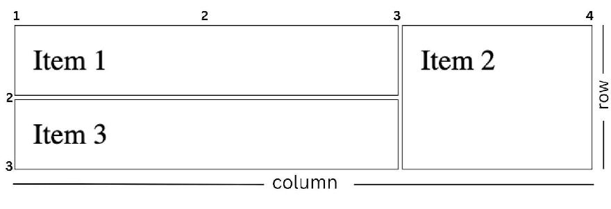
In the image above, I’ve personally taken the time to label the grid points for your convenience. This way, you can easily identify where each grid column and row starts and ends. I find this solution particularly helpful because it adds clarity and simplifies the process of working with grids.
Grid Template Area
This is one of the grid placement methods I love because it allows us to create unique layouts by defining named grid areas. By assigning labels to grid areas, you may generate customized layouts using this feature. It provides a logical and systematic framework for creating intricate designs. Each grid item’s location inside the designated grid regions may be adjusted by assigning the grid-area property.
Each string will stand in for one row of the grid when defining grid are\s. The designated regions are separated by blanks inside each row and may span more than one cell. Remember that the grid spaces should be in a rectangular configuration. Just enter a period (.) in an empty cell to indicate that it should remain so. In addition, if the name of a grid area appears more than once in a single row, it means that the region in question spans more than one column. Likewise, if the same name appears in many rows in a row, it indicates that the region covers multiple rows. Working with grid-template-areas is a pleasure for me since it facilitates a more visual and intuitive approach to layout design.
Here’s an example to illustrate the use of grid-template-areas:
<!DOCTYPE html>
<html lang="en">
  <head>
    <style>
      .grid-container {
        display: grid;
        grid-template-columns: 1fr 3fr;
        grid-template-rows: auto 1fr auto;
        gap: 10px;
        text-align: center;
        grid-template-areas:
          "header  header"
          "sidebar content"
          "footer  footer";
      }
      .item {
        border: black 2px solid;
        font-size: 3rem;
      }

      .header {
        grid-area: header;
      }

      .sidebar {
        grid-area: sidebar;
        height: 300px;
      }

      .content {
        grid-area: content;
      }

      .footer {
        grid-area: footer;
      }
    </style>
  </head>
  <body>
    <div class="grid-container">
      <div class="item header">Header</div>
      <div class="item sidebar">Sidebar</div>
      <div class="item content">Content</div>
      <div class="item footer">Footer</div>
    </div>
  </body>
</html>

In my experience, the grid template area offers a fantastic way to carefully design the structure of your layout. Personally, I appreciate how customizable it is, allowing you to tailor it to your specific needs.
Responsive design with CSS grid
Responsiveness has never been this high. One of the major reasons CSS grid is used is its ability to create responsive designs with ease. With or without the use of media queries, the CSS grid can be customized to fit different screen sizes.
Fluid Grid
It’s a brilliant idea in web design to provide items the ability to resize and reposition themselves depending on the size of their container or the screen. Fluid grids allow designers to create layouts that scale well across a wide range of screen sizes and resolutions, making for more responsive and user-friendly experiences overall. Instead of utilizing absolute units like pixels, web designers crafting fluid grids use relative units like percentages, fr (fractional units), or auto. The grid can adapt to different screen sizes and resolutions thanks to this feature.
The only thing you have to do is set relative units for the grid-template-columns and grid-template-rows attributes. My go-to strategy involves making use of fr units, which stand for a proportion of the total grid container size. Still another option is to provide the column and row sizes as a percentage of the container size.
<!DOCTYPE html>
<html lang="en">
  <head>
    <style>
      .grid-container {
        display: grid;
        grid-template-columns: repeat(3, 1fr);
        grid-gap: 10px;
      }
      .grid-item {
        border: 1px solid #ccc;
        padding: 10px;
        background-color: #f5f5f5;
      }
    </style>
  </head>
  <body>
    <div class="grid-container">
      <div class="grid-item">Item 1</div>
      <div class="grid-item">Item 2</div>
      <div class="grid-item">Item 3</div>
      <div class="grid-item">Item 4</div>
      <div class="grid-item">Item 5</div>
      <div class="grid-item">Item 6</div>
      <div class="grid-item">Item 7</div>
      <div class="grid-item">Item 8</div>
      <div class="grid-item">Item 9</div>
      <div class="grid-item">Item 10</div>
    </div>
  </body>
</html>

Based on our code, this is the result we get, 3 columns having equal fraction of width.
Auto-placement and Grid-auto-flow
These are CSS Grid characteristics that determine the default placement of grid objects when their absolute coordinates are not known. This is helpful when working with dynamic material or when designing a layout that can adapt to a varying amount of elements.
Auto-placement algorithm:
By default, CSS Grid will arrange its content in the HTML source order when placing items in the grid. The grid cells are filled by the auto-placement algorithm in a row-first fashion (from left to right, top to bottom). When a row runs out of room, its contents are shifted to the row below.
Grid-auto-flow property:
For this property, you are allowed to control the auto-placement behavior by specifying the direction in which items should be placed. You can either specify the grid-auto-flow value to be row, column, or dense.
The row value is the default setting for the grid auto-flow. With this, tiles are placed row by row, filling the rows in a left-to-right, top-to-bottom order.
As for the column, items are placed column by column, filling the columns in a top-to-bottom, left-to-right order. and lastly, the dense, which places items in a way that tries to fill empty gaps in the grid.
All this can result in a more compact layout, but the items might not appear in the order they are defined in the HTML source.
<!DOCTYPE html>
<html lang="en">
  <head>
    <style>
      .grid-container {
        display: grid;
        grid-template-columns: repeat(auto-fit, minmax(300px, 1fr));
        grid-gap: 10px;
        font-size: 3rem;
        grid-auto-flow: dense;
      }

      .grid-item {
        border: 1px solid #ccc;
        padding: 10px;
        background-color: #f5f5f5;
      }
    </style>
  </head>
  <body>
    <div class="grid-container">
      <div class="grid-item">Item 1</div>
      <div class="grid-item">Item 2</div>
      <div class="grid-item">Item 3</div>
      <div class="grid-item">Item 4</div>
      <div class="grid-item">Item 5</div>
      <div class="grid-item">Item 6</div>
      <div class="grid-item">Item 7</div>
      <div class="grid-item">Item 8</div>
      <div class="grid-item">Item 9</div>
      <div class="grid-item">Item 10</div>
    </div>
  </body>
</html>

This is an excellent example of grid-auto-flow. When a particular width is achieved, the columns and rows change to fit the items.
Browser support and accessibility
All major current browsers have solid support for CSS Grid. The incompatibilities with earlier browsers, especially Internet Explorer, must be taken into account, however.
The following web browsers support CSS Grid:
- Google Chrome (version 57 and later)
- Firefox by Mozilla (version 52 and later)
- Safari (version 10.1 and later)
- Microsoft’s New Web Browser, Edge (version 16 and later)
- Opera (version 44 and later)
Even when utilizing the earlier, prefixed version of the standard, Internet Explorer 10 and 11 only provide limited support for CSS Grid (-ms-grid). Unfortunately, there are significant changes between this version and the current recommended version of CSS Grid, and many features have been omitted. You may need to offer a fallback layout using methods like Flexbox or float-based layouts in order to support Internet Explorer. But it you want to check the current browser support for CSS Grid on websites like Can I use (https://caniuse.com/css-grid).
Conclusion
In conclusion, I believe CSS Grid to be a potent and flexible layout framework that has significantly changed the process of developing website layouts. It provides web developers with a versatile and straightforward method for designing grid-based layouts that is capable of producing sophisticated, mobile-friendly, and ADA-compliant sites. CSS Grid is a new layout technique that has gained widespread browser support, making it an essential component of any modern website. As more programmers learn about and use CSS Grid, the web will grow in vitality and accessibility. Web designers and developers who have mastered the nuances of CSS Grid and who adhere to best practices for browser compatibility and accessibility may create responsive, accessible, and future-proof layouts for a wide range of users and devices.
For further study i suggest you take a look at this document


